This is a personal design challenge I took on to enhance my dark mode UI design skills. I used hierarchy, consistency, contrast, and proximity to create an intuitive NFT market user interface that meets WCAG accessibility standards.

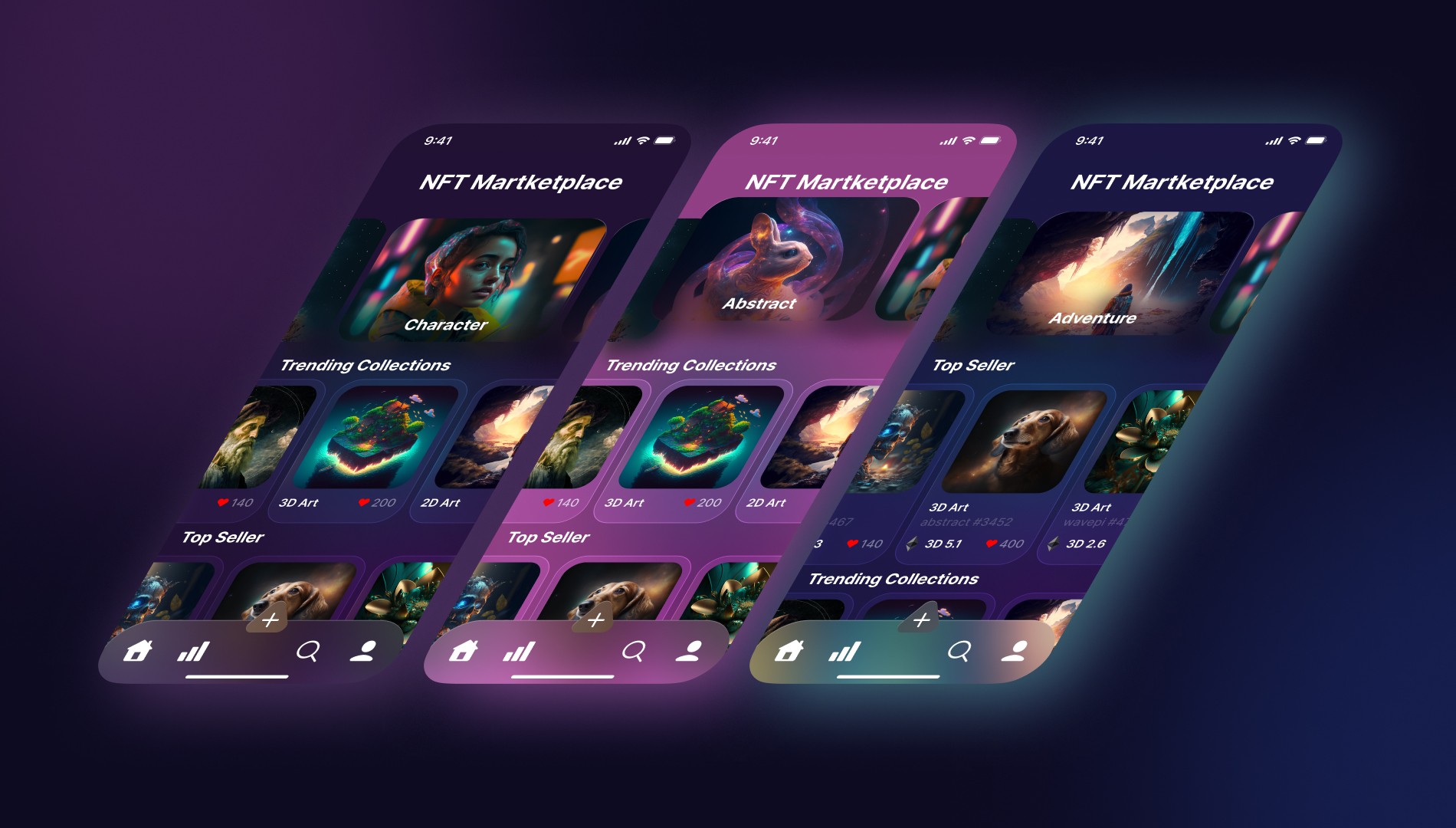
Fig. 1. Screenshot of the first screen designed with a pink background (first iteration)!
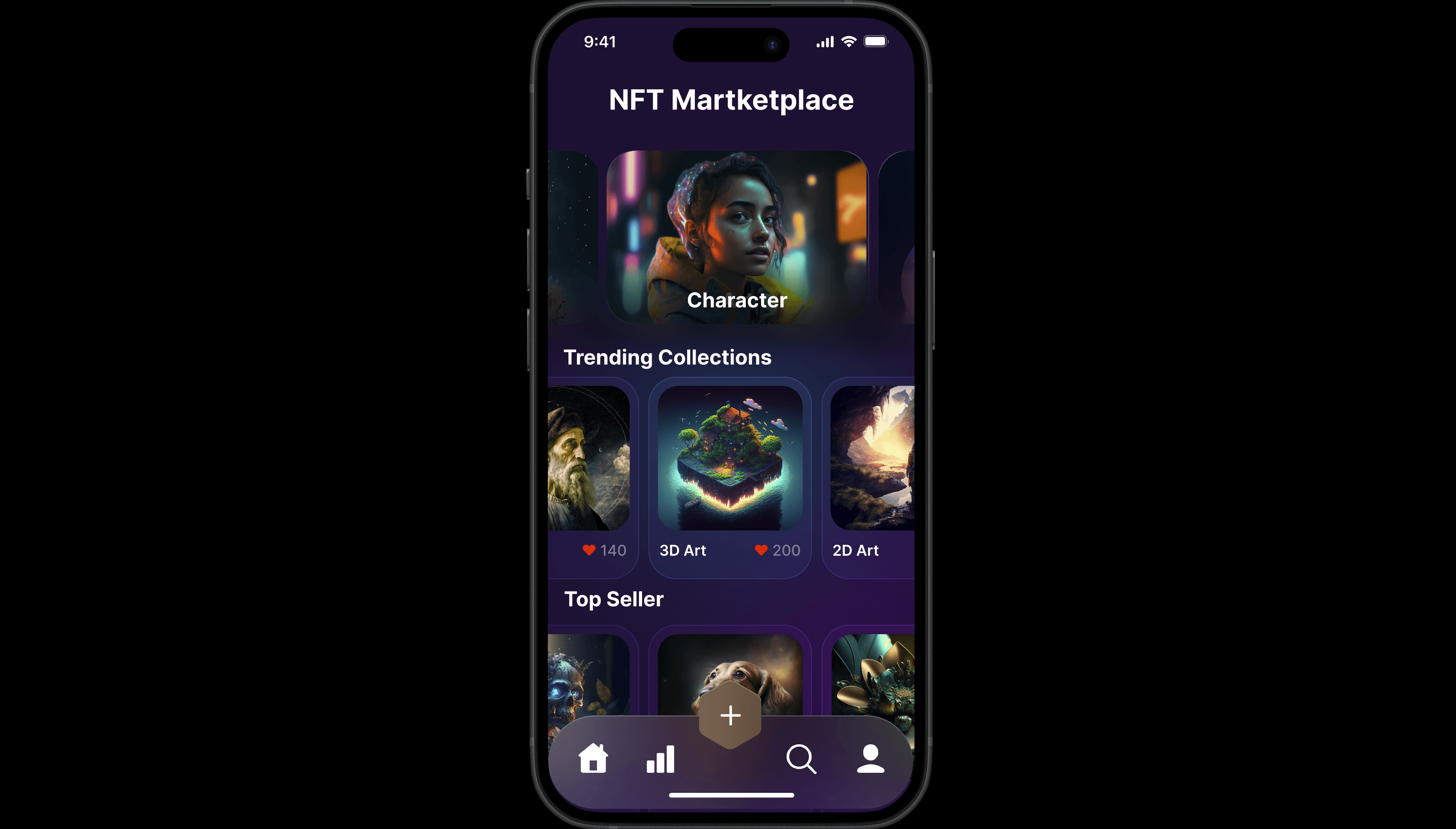
Fig. 2. Screenshot of the first screen designed with a dark purple background (second iteration)!
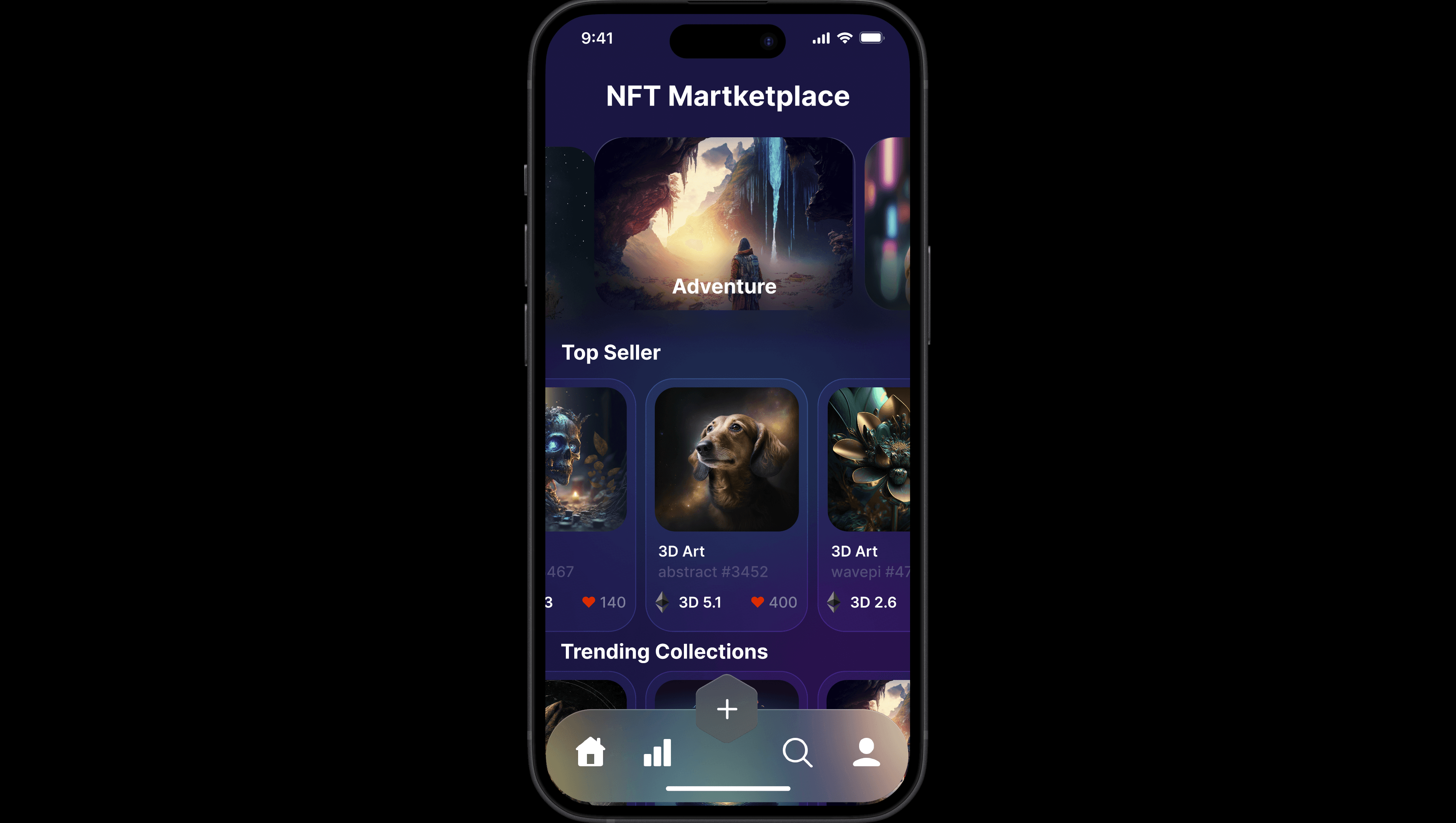
Fig. 3. Screenshot of the first screen designed with a dark blue and purple gradient background (third iteration)!
Key Design Principles
Hierarchy: Guides users to key information using size, color, and layout, ensuring clarity and focus on important elements.
Consistency: Creates a cohesive experience by maintaining uniform styles for fonts, buttons, and interactions across the interface.
Contrast: Enhances readability in dark mode by using sufficient contrast between text and background, aligning with WCAG accessibility standards.
Proximity: Groups related elements together for intuitive navigation, reducing clutter and improving usability.
Takeaways
Overall, I was happy with my design. I showcased my ability to blend creativity with strategic design thinking, creating a unique user interface that could resonate with a Gen Z and Alpha audience. 🤩