This project represents a personal design challenge to elevate my UI design skills through hands-on practice. By integrating key UI design principles—such as hierarchy, consistency, contrast, and proximity—I am creating an intuitive and accessible user experience.
Key Design Principles
Hierarchy: Establishing a clear visual hierarchy that guides users seamlessly through the interface, enhancing usability and engagement.
Consistency: Maintaining a uniform design language across all elements fosters familiarity and builds trust with users, making their interaction more enjoyable.
Contrast: Thoughtful use of contrasting colours and elements highlights critical features and improves readability, ensuring users can navigate effortlessly.
Proximity: Grouping related items effectively creates a logical flow, making the interface intuitive and user-friendly.
Through this project, I aim to showcase my ability to blend creativity with strategic design thinking, ultimately crafting experiences that resonate with users and meet their needs 🤩
Final Design
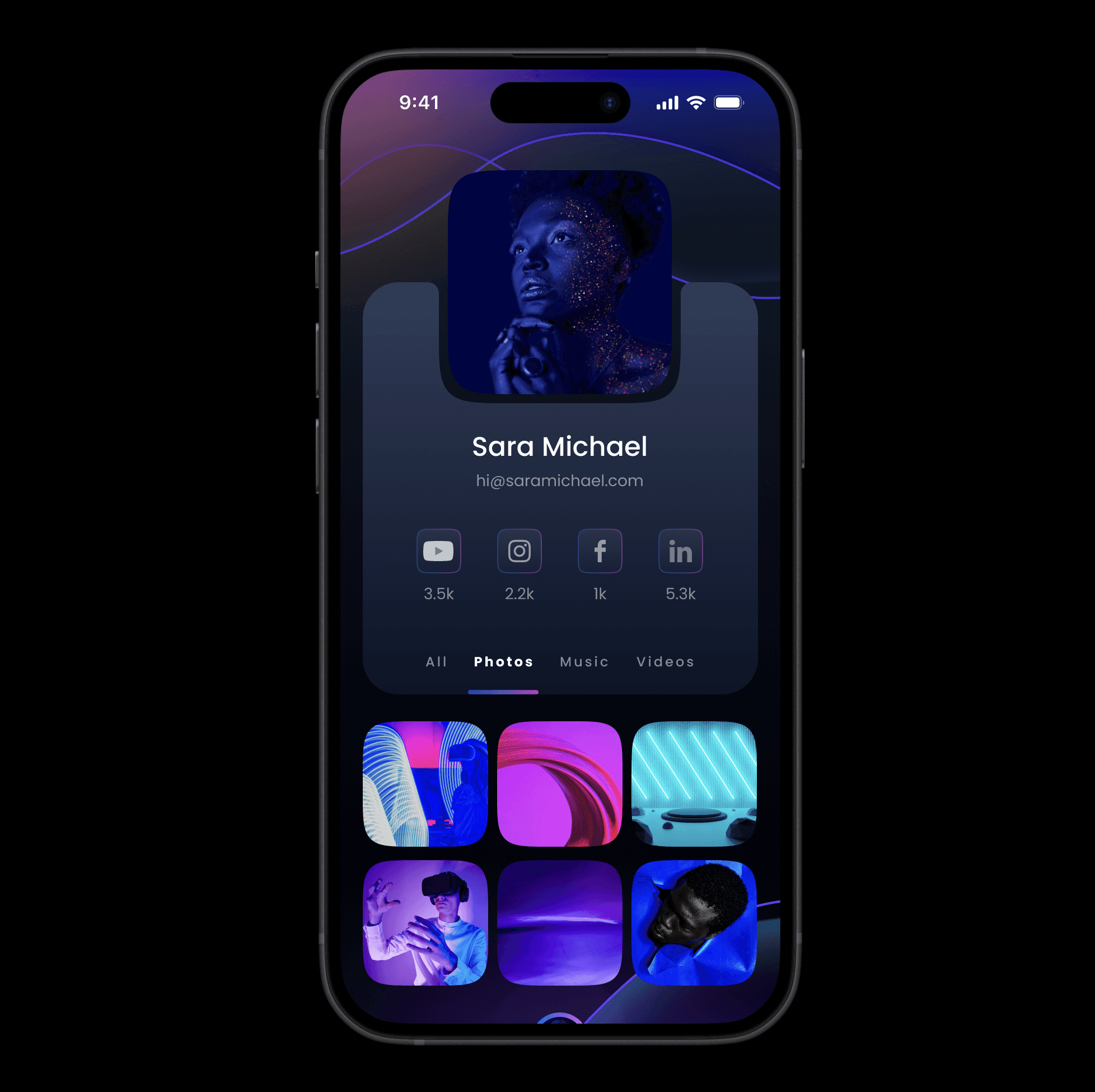
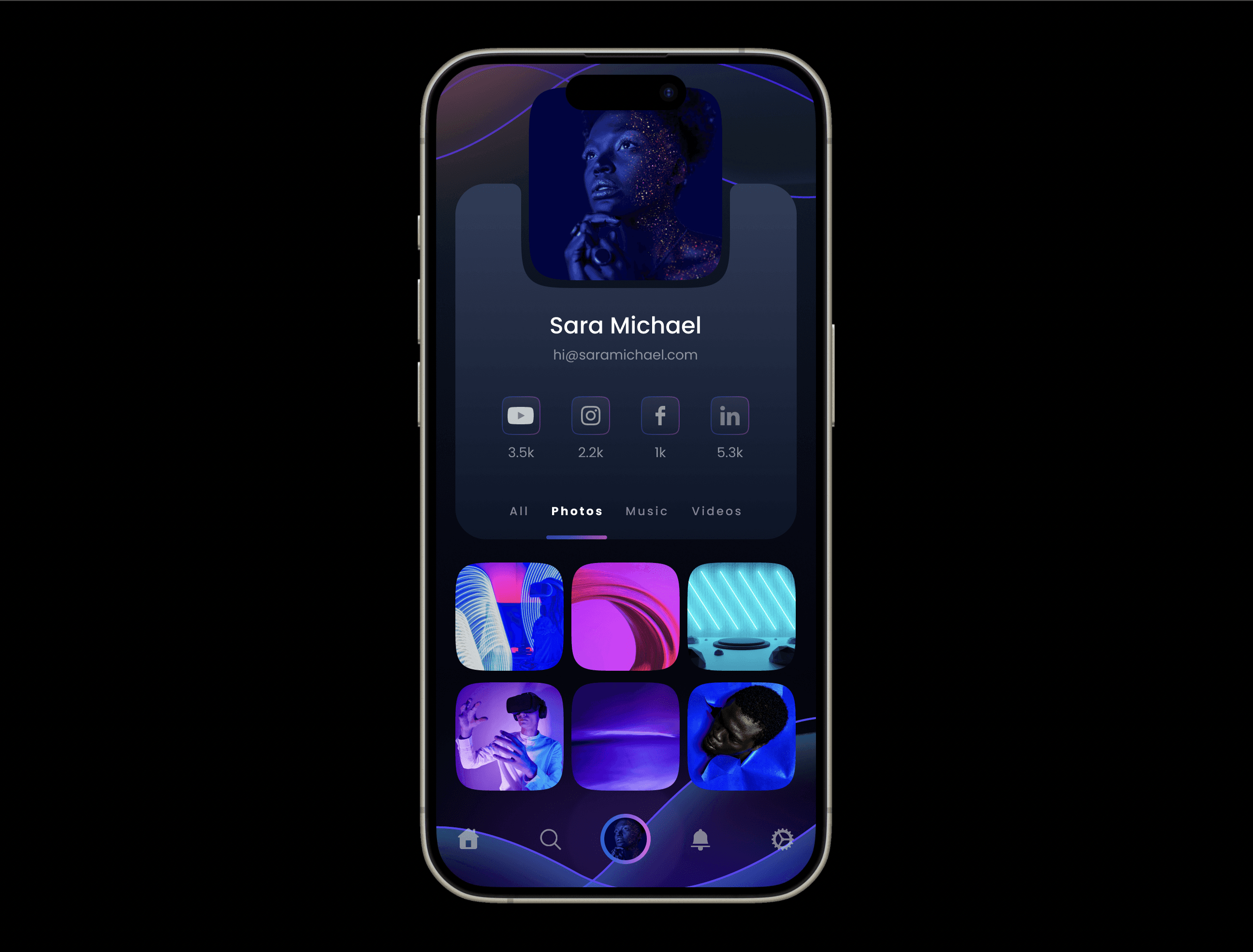
Here is the final design of the user profile interface. This challenge was a lot of fun. It taught me how to work with vector shapes, adding various elements to the background. 🎉

Fig 1. Screenshot of the user interface design of a user profile not including the tab bar at the bottom of the UI.

Fig 2. Screenshot of the user interface design of a user profile including the tab bar at the bottom of the UI.


