Introduction
This project was completed for the final assignment of our "Servers, Networks and Database" course at Seneca Polytechnic under the supervision of our professor Dr. Andre Plante!
Virtual Visions Seneca is a dynamic virtual art gallery featuring AI-generated 3D art from Dalle-3 and Midjourney. We started with low-fidelity sketches and refined the design through mid-fidelity, incorporating WordPress features to enhance UX. The result was a fully responsive, polished website that showcases both creative and technical skills.
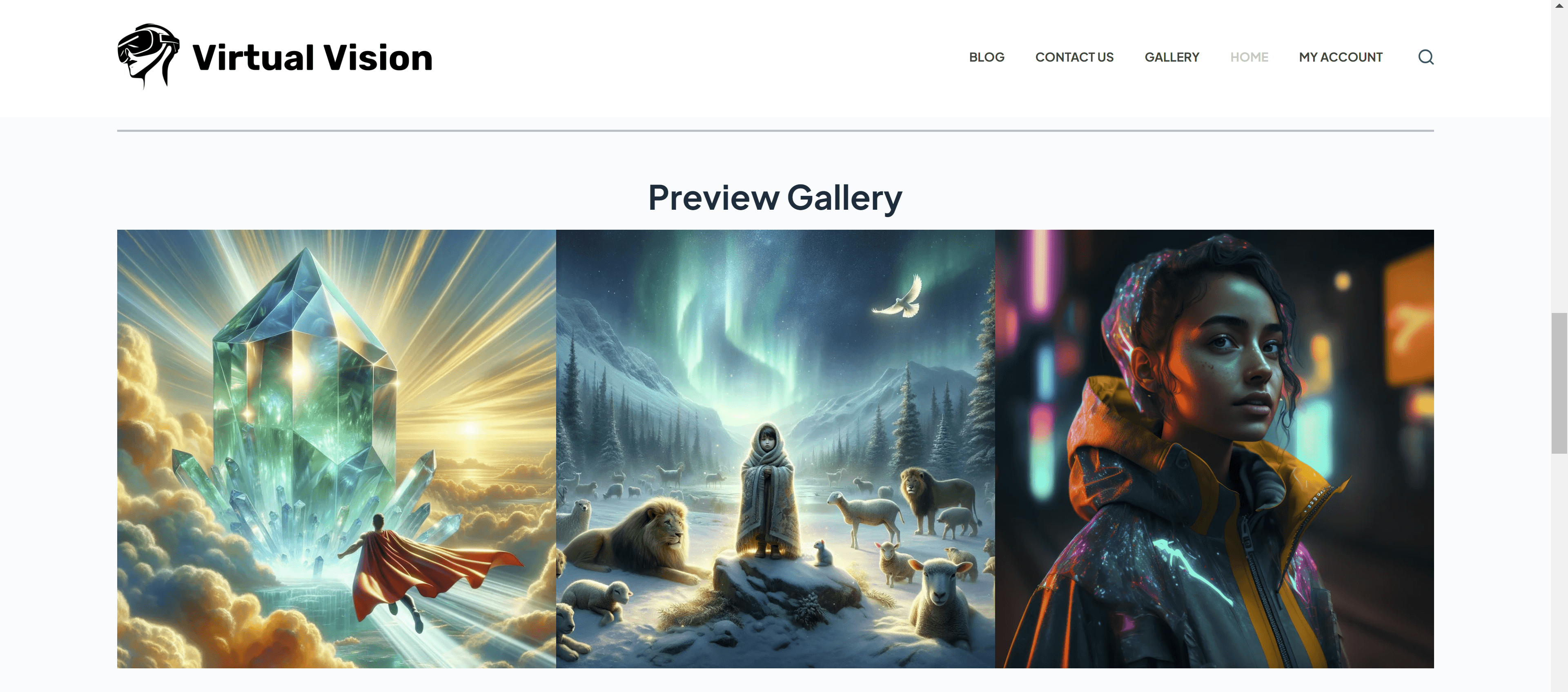
Fig. 1. Screenshot of the preview gallery on the home page. The gallery is a component that contains three images. Baudin, R., Graungaard, N., Steele, T., & Truong, N. Q. (2023, November 22). Home Page. Virtual Visions Seneca. Retrieved November 28, 2023, from http://virtualvisionsseneca.net
Challenges
Working on our first interactive website using WordPress, our team of four faced challenges due to our inexperience with the platform and managing a live website. With only 2-3 weeks to complete the project, we struggled to create a cohesive design, balancing elements like color palette, typography, and hierarchy. Despite our skills in rapid prototyping, integrating these design elements into WordPress proved difficult, and establishing a unique identity for the website was a key challenge.
Problem Statement
How might we enhance the interactivity and immersion of Virtual Visions Seneca’s online art gallery to simulate a physical gallery experience for university and college students?
User Personas
Our group generated two specific user personas for the targeted student groups that we want to engage with our interactive gallery. The user persona is drafted by Justin and myself using Figma to define a target audience for Virtual Visions.
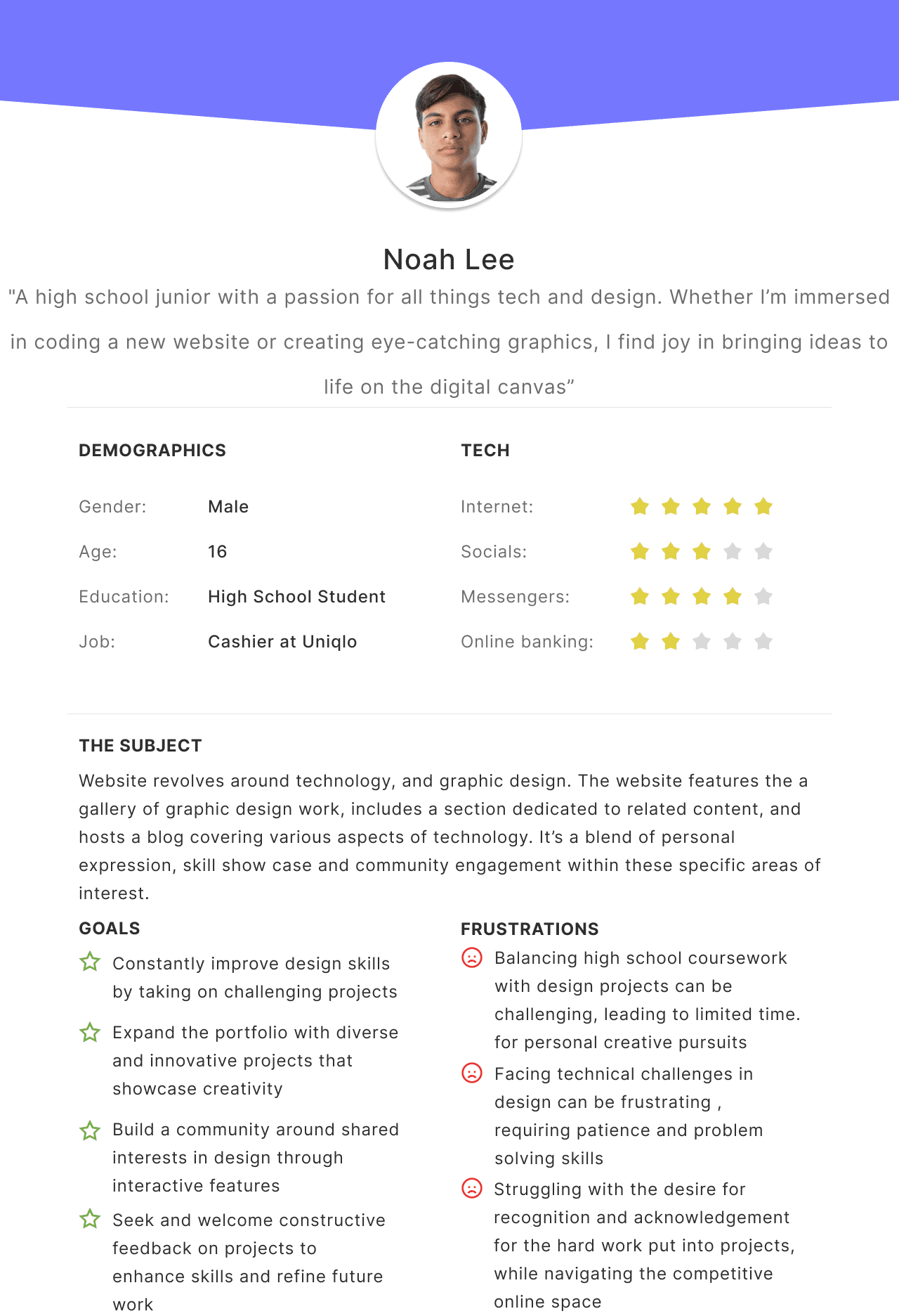
Fig 2. Bohatskyi, O., & UXIS. (2023). UX / User Personas Template. Figma. Retrieved November 28, 2023, from https://www.figma.com/community/file/1131541285316096981/ux-user-personas.
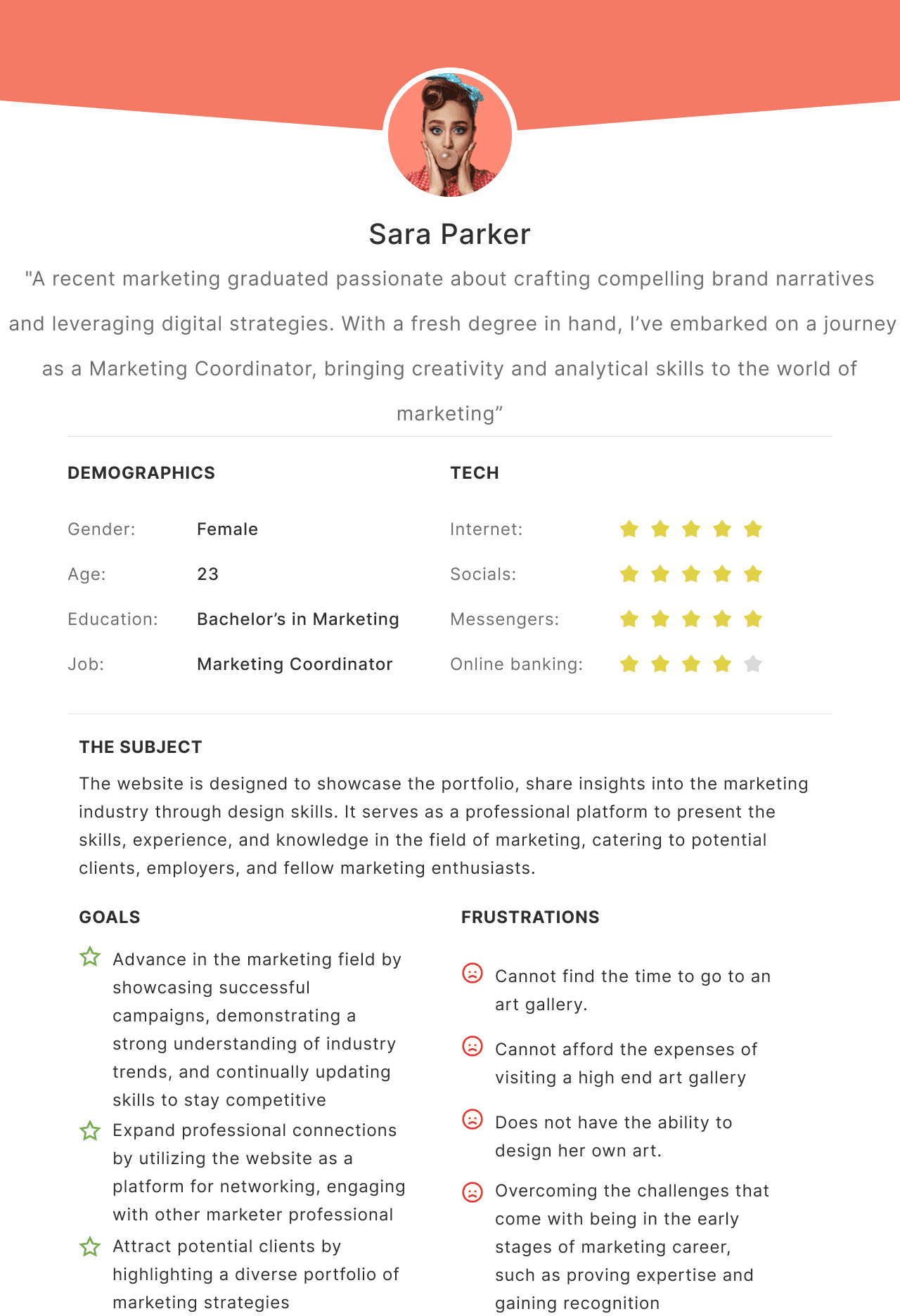
Fig 3. Bohatskyi, O., & UXIS. (2023). UX / User Personas Template. Figma. Retrieved November 28, 2023, from https://www.figma.com/community/file/1131541285316096981/ux-user-personas.
Ideation
In our ideation process for Virtual Visions Seneca, we utilized rapid prototyping to quickly sketch the home, contact, and blog pages, creating low-fidelity wireframes. This method was crucial as it allowed us to swiftly explore design options and iterate based on immediate feedback, ensuring the development of user-friendly and visually appealing designs. Rapid prototyping proved essential for accelerating our design process and enhancing the overall user experience given the limited we had as a group to complete an interactive site from start to finish.
Low Fidelity Sketches
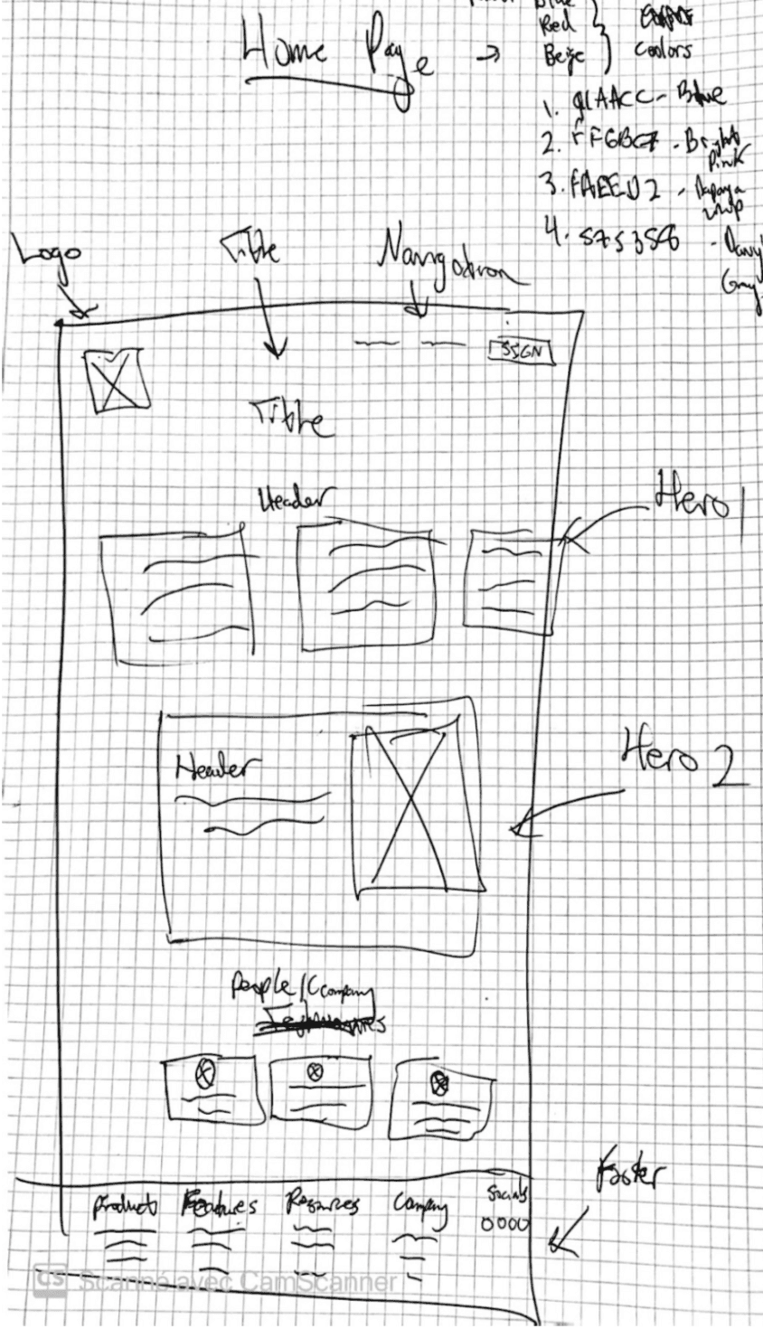
Fig. 4. Screen capture of a low-fidelity mockup sketch for the homepage of the Virtual Visions webpage which includes a navigation bar, buttons, Hero section, title headers, people who are involved in the website building of the virtual art gallery and the footer which sits at the bottom of the page. Ryan Baudin. (2023). Scans Of The Low Fidelity Mockups for Virtual Visions. CamScanner
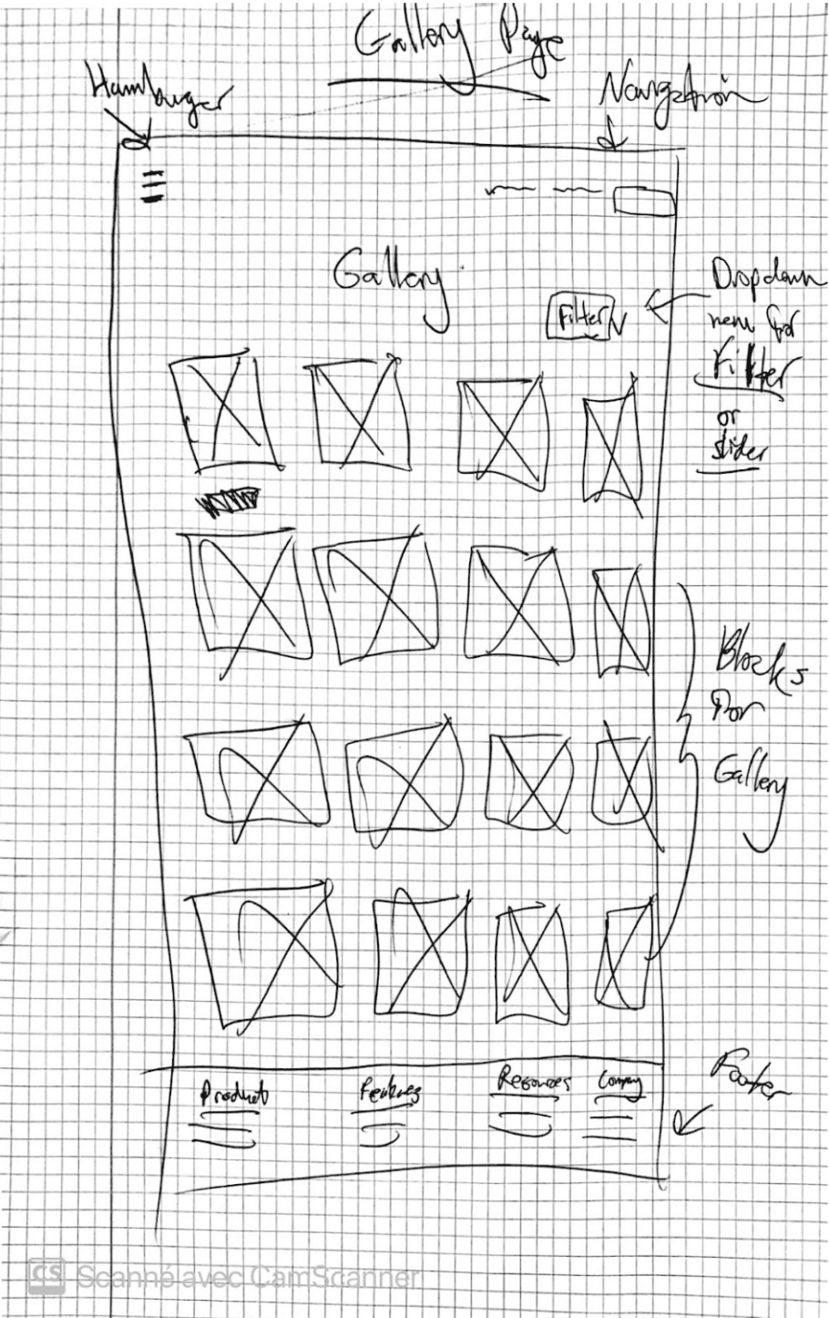
Fig. 5. Image is a screen capture of a low-fidelity mockup sketch for the gallery of the Virtual Visions webpage which includes a navigation bar, buttons, title, headers, images and the footer which sits at the bottom of the page. The gallery images are in block style (rows and columns of 4) so that the organization and hierarchy of the webpage are optimised and easy for users to navigate. Ryan Baudin. (2023). Scans Of The Low Fidelity Mockups for Virtual Visions. CamScanner.
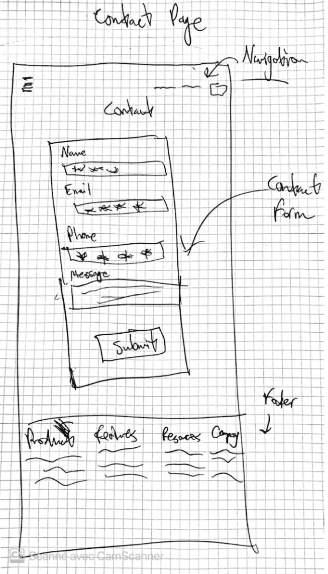
Fig. 6. Screen capture of a low fidelity mockup sketch for the contact form of the Virtual Visions webpage which includes a navigation menu, forms to fill out such as name, email, phone number, message and more submit button, and the footer which sits at the bottom of the page to links to the rest of the pages on the website. Ryan Baudin. (2023). Scans Of The Low Fidelity Mockups for Virtual Visions. CamScanner.
Colour Palette
In the ideation process for Virtual Visions Seneca, we used Coolors to quickly generate a vibrant color palette aimed at young students. The chosen colors—powder blue, rose pink, light papaya, and davy grey—convey a fun, aesthetic vibe while enhancing legibility and navigability, ensuring the website is both visually appealing and user-friendly. In the end, we defaulted to using the WordPress creative theme colours of medium grey, light-blue grey, black and white.
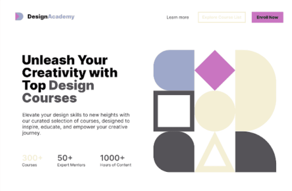
Fig. 7. This is the visual for a UI layout of a website that uses the colour palette Coolors has generated for Virtual Visions. The issue is that the papaya colour on the text is not legible so the contrast would have to increase if we would need to change the text to davy grey, Source: Ryan, B., & Coolors. (2023). Coolors Colour Palette Visualizer. Coolors. Retrieved November 28, 2023, from https://coolors.co/visualizer/91aacc-ff6bc7-faeed2-575358
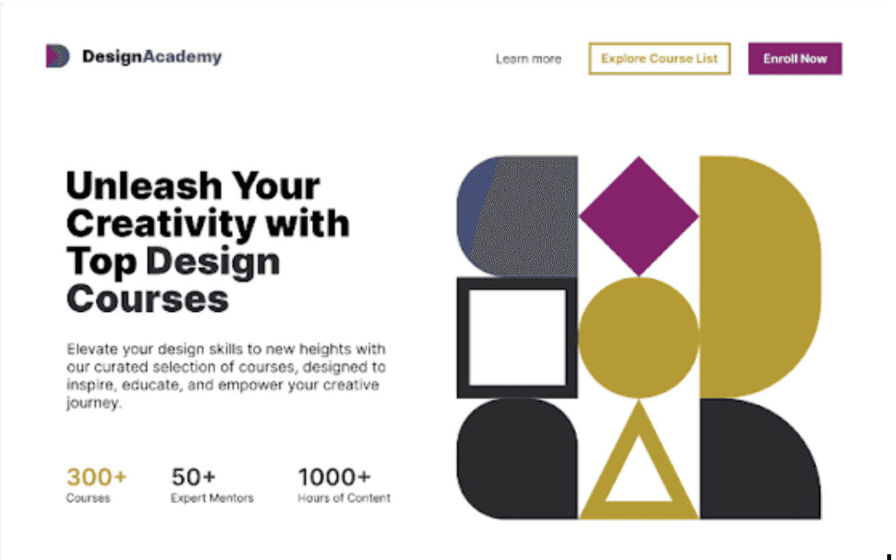
Fig. 8. This is the visual for a UI layout of a website that uses the colour palette Coolors has generated for Virtual Visions with the brightness of the colours turned down 50%. Significant contrast between text and background making text navigation and hero more legible. Ryan, B., & Coolors. (2023). Coolors Colour Palette Visualizer. Coolors. Retrieved November 28, 2023, from https://coolors.co/visualizer/91aacc-ff6bc7-faeed2-575358
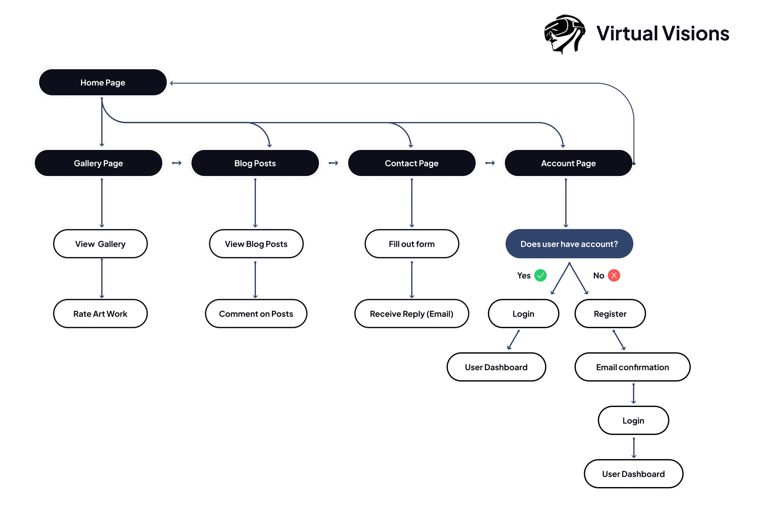
User Flow
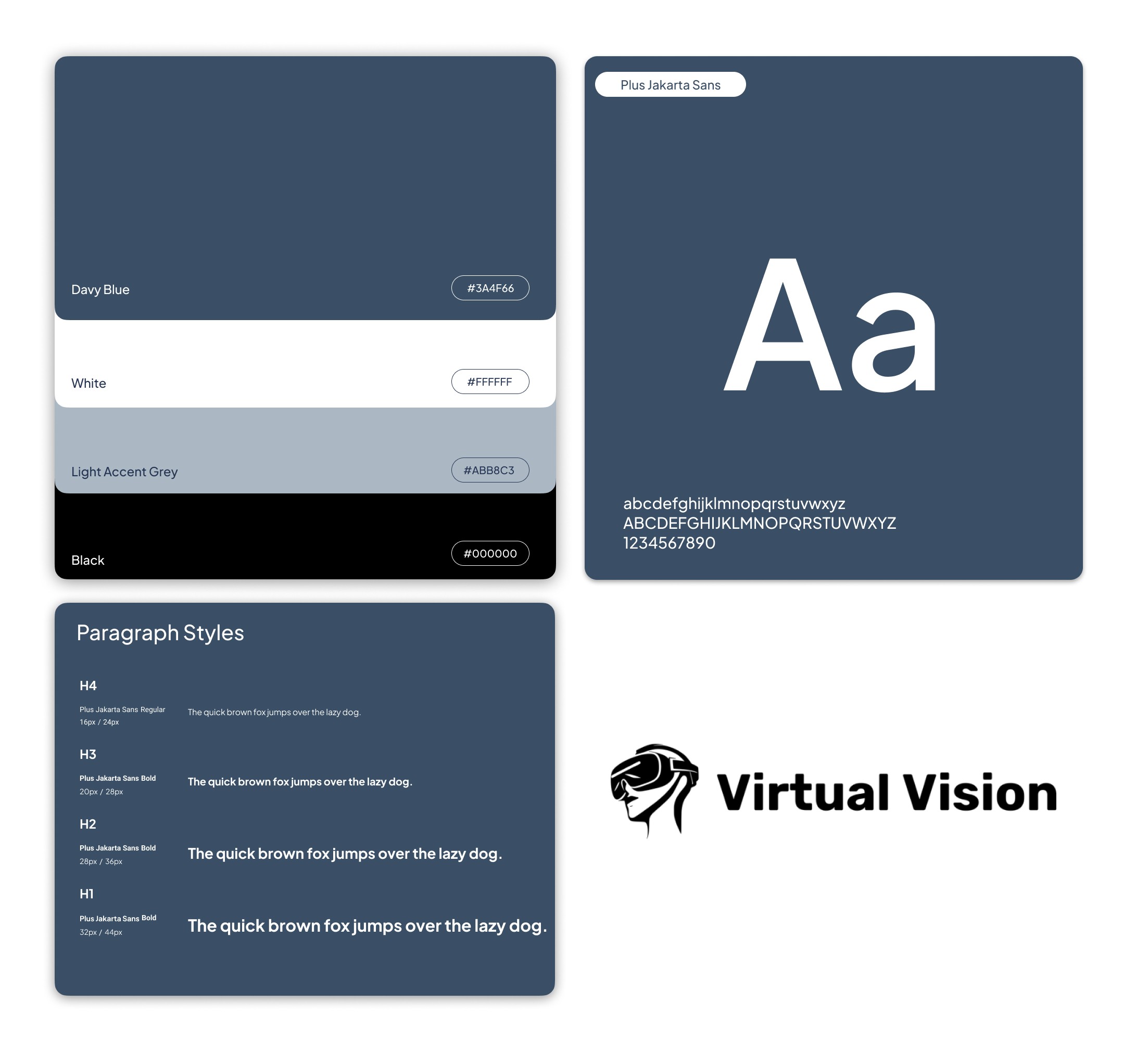
Typography and Colour
Early Concept - Iteration 1
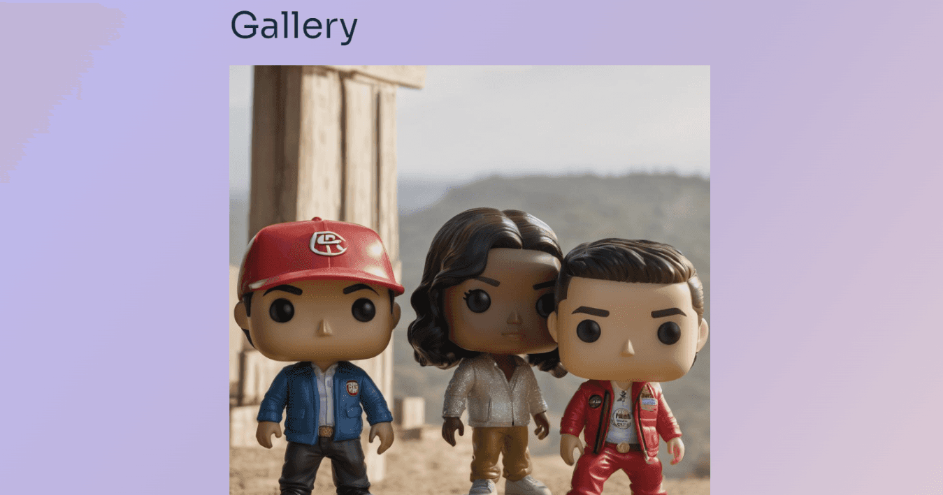
For Virtual Visions Seneca, we developed two key iterations before finalizing the interactive website, focusing on a visually engaging and functional design. While the process was efficient, we identified the need for more usability testing and user feedback to improve future mid-fidelity prototypes.
Fig. 9. A very early look at the gallery section of the website (note the lack of a proper colour scheme.) The images were made by AI website Gencraft with the prompts “funko pop” and “funko pop figure”. In later drafts, the gallery images would have user information such as who created it and when. The background colour used is a light purple (#BDB8EE) gradient that transitions to a light pink (#D9C7D5) towards the bottom right corner.
High-Fidelity Mockups - Iteration 2
Based on the research for our targeted audience (adolescents and young adults), the group elected for a simple WordPress's "CreativeTheme" template that could help us build our home page, gallery, contact, blog and profile pages. A crucial factor is make sure that the website is accessible, user-friendly and easy to navigate. Thus, the WordPress template having a preassigned theme (for layout, hierarchy, colour palette and more) would accelerate the final design process.

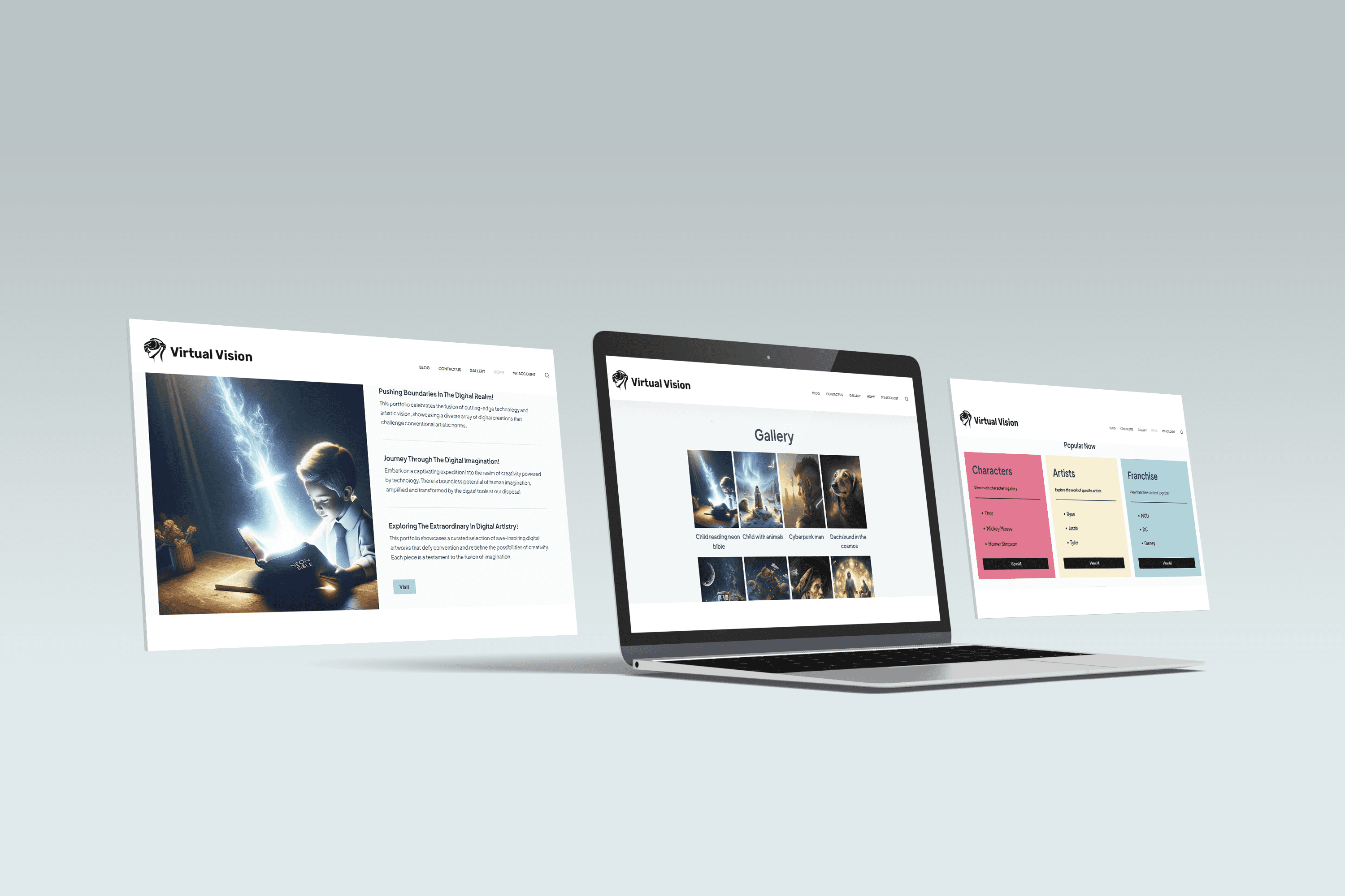
Fig 10. Photo-bash and photo stack created using Figma to showcase the final iteration and high fidelity mockup of Virtual Visions Seneca. Baudin, R., Graungaard, N., Steele, T., & Truong, N. Q. (2023, November 22). Home Page. Virtual Visions Seneca. Retrieved November 28, 2023, from http://virtualvisionsseneca.net
Final Prototype
Here is the final prototype that is fully functional and live! 🥳
Key Challenges and Takeaways 🔑
This project came with a lot of key challenges and successes. Dr. Plante graded our project with a perfect score for this assignment. In sum, we launched a fully interactive site for the first time in approximately three weeks with a functioning gallery, home page, contact page, blog post and more. Users can leave reviews and rate their favourite art! We built a highly interactive site featuring a neat zoom-in function on each image and a functioning user search feature for the gallery!
The impact of thorough research in understanding and addressing user needs cannot be overstated. In future projects, I plan to invest more time in user testing rounds, A/B testing, and tracking user activity to gain deeper insights into how users interact with prototypes. With more user feedback, I can create more accessible and user-friendly experiences.
I underutilized the color library I developed for this project, defaulting to WordPress theme palettes. Moving forward, I aim to fully leverage my design libraries, iterating from them to enhance the visual appeal and consistency of my work.
I recognize the need to sharpen my WordPress skills for future projects. While I gained foundational knowledge in basic web design during this project, there's significant room for growth. I plan to deepen my expertise in advanced features such as 3D web design, animation, and AR integration to create more interactive and engaging websites that go beyond standard functionality. Expanding these skills will enable me to deliver more immersive user experiences.
Credits
I would like to thank Dr. Andre Plante at Seneca Polytechnic for his invaluable guidance throughout the design process of Virtual Visions Seneca. A special thanks to my classmates Nicole, Tyler, and Justin for their outstanding teamwork and support in making this project possible 👏.
