Introduction
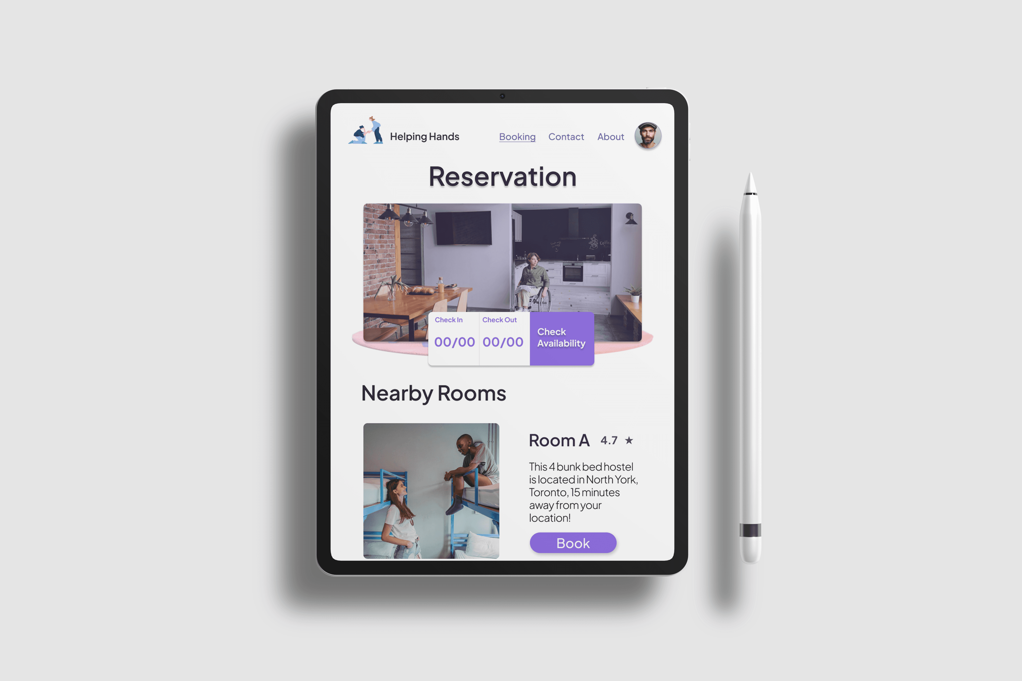
Helping Hands is a design for social change, a tablet prototype built using Figma. The project started as a concept for a kiosk aimed to create an accessible platform for homeless individuals in downtown Toronto seeking shelters or rooms. The end goal of this design was to ensure that these individuals had a simple and effective way to find a safe place to stay. The final deliverable was a high-fidelity, responsive, interactive prototype built using Figma. The project was a success, resulting in a polished prototype that effectively demonstrated the potential impact of the Helping Hands initiative.
Challenges
With tight time constraints and looming deadlines, I found it challenging to conduct thorough ethnographic research. Working within the limited time, I had to rely more on quantitative research than qualitative insights. Since this was only my second Figma project in school, the entire iteration process took longer than expected.
Creating wireframes, a high-fidelity mock-up, and a working prototype for the final project was time-intensive. Additionally, during the design stage, I struggled to find a warm and inviting colour palette that would complement the message of Helping Hands. Despite these challenges, I was determined to create a meaningful and impactful design.
Problem Statement
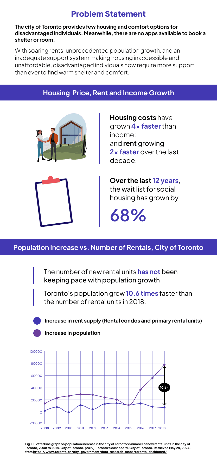
The Helping Hands project addresses the significant issue of homelessness and the barriers to accessing shelter resources for disadvantaged individuals in the Greater Toronto Area. The Toronto Foundation's Vital Signs report underscores the critical need for accessible support systems to aid those struggling with finding safe housing.
User Research and Insights
Using data from Toronto's social and economic indicators and the Toronto Foundation's Vital Signs special report (Toronto Foundation, 2023), it became clear that there is a significant gap between the supply of rental housing and the demand created by the city's rapidly increasing population. This imbalance has led to a surge in the need for public housing and shelters, as many people find themselves without a home. Helping Hands is designed to address this critical issue. The report further reveals that the growth rate of rental unit supply is 10.6 times lower than the rate of population increase in Toronto, highlighting the urgent need for more accessible housing solutions.
After further research, I discovered that there is one application such as the Homeless Resources-Shelter App (apple app store only) that can help the user find services, shelters and food banks nearby the user. However, no apps are specifically designed to allow disadvantaged folks to book a shelter and find availability for shelter resources. The only app that comes remotely close is Google Maps but it falls short of meeting the criteria for a dedicated homeless shelter booking app. Google Maps provides general location information but lacks the necessary features to address the specific needs of homeless individuals seeking immediate shelter and resource availability. This gap in the market further emphasized the importance and potential impact of the Helping Hands project.
User Personas
According to Fred Victor, a social service charitable organization dedicated to creating lasting and positive change in the lives of homeless and low-income individuals in Toronto, approximately 10,000 people experience homelessness daily (fredvictor.org, 2023). Various factors contribute to homelessness, including job loss, family violence, family break-up, mental illness, poor physical health, substance abuse, and physical, sexual, or emotional abuse.
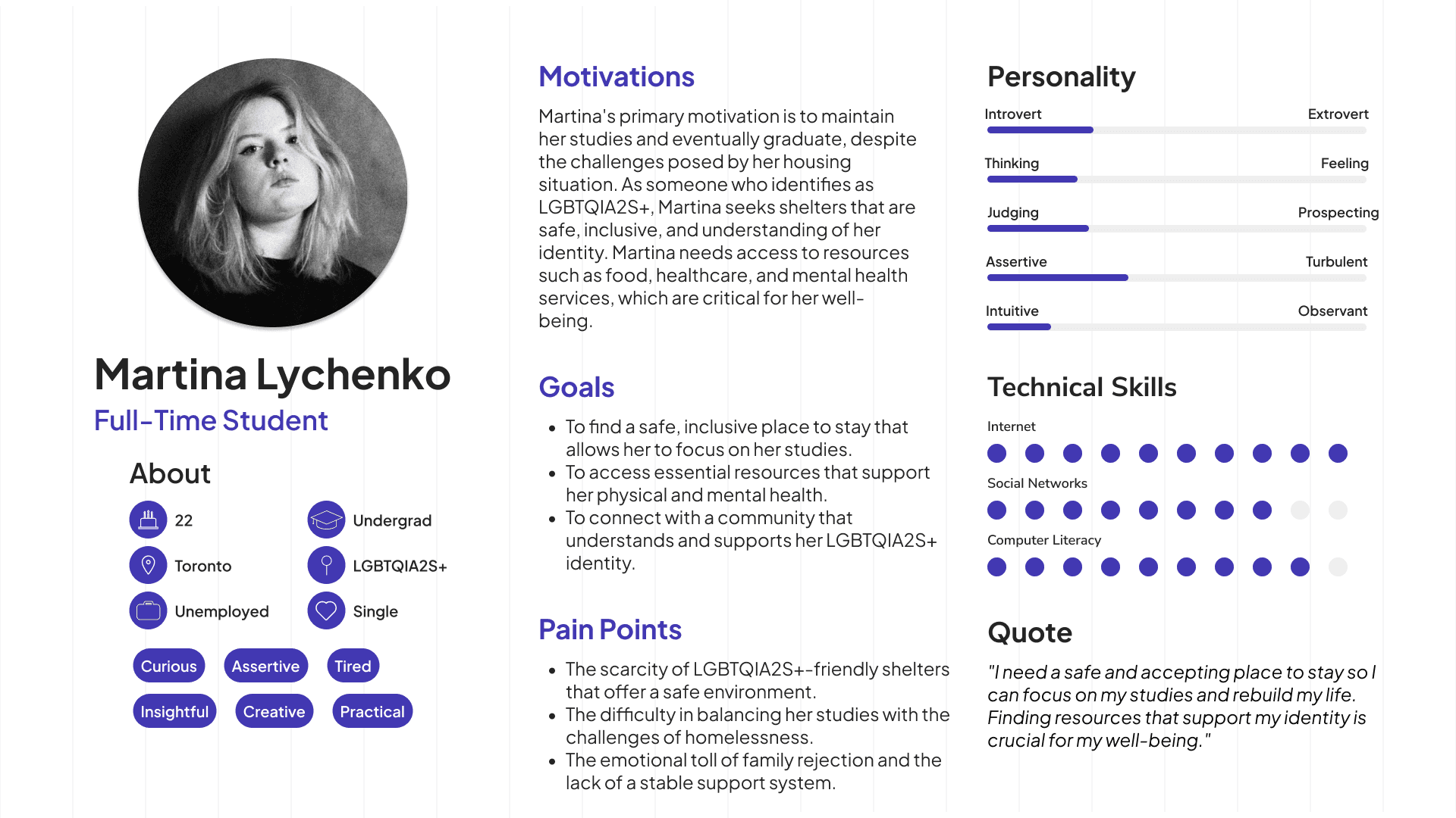
The 2021 Street Needs Assessment Results Report by the City of Toronto reveals that 21% of the homeless population identifies as Indigenous, and approximately 12% self-identify as LGBTQ2S+ (City of Toronto, 2021, p. 11). Recognizing the diverse needs of these marginalized communities, Helping Hands is designed to drive social change by providing an inclusive platform that supports all members of disadvantaged and marginalized groups.
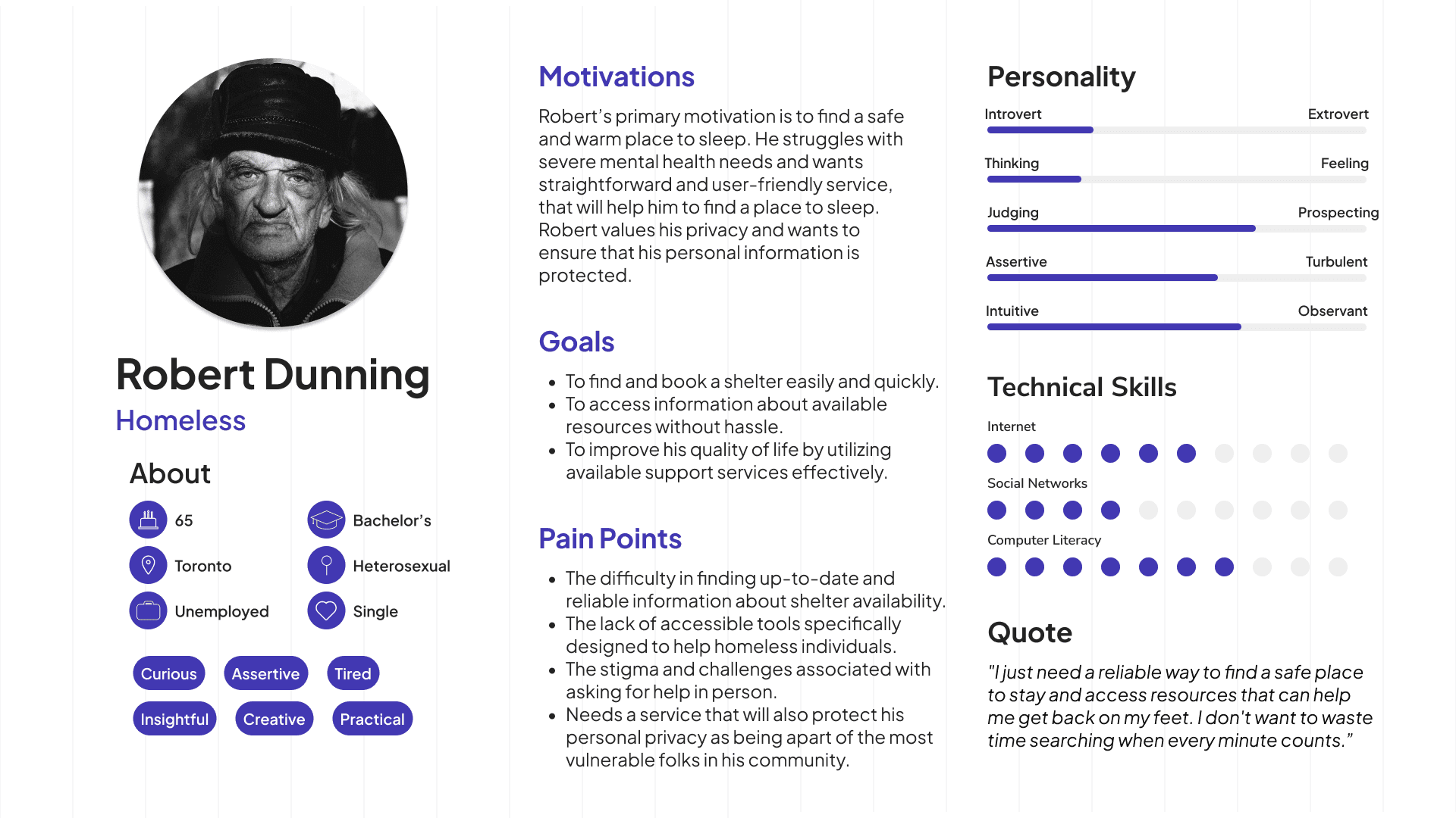
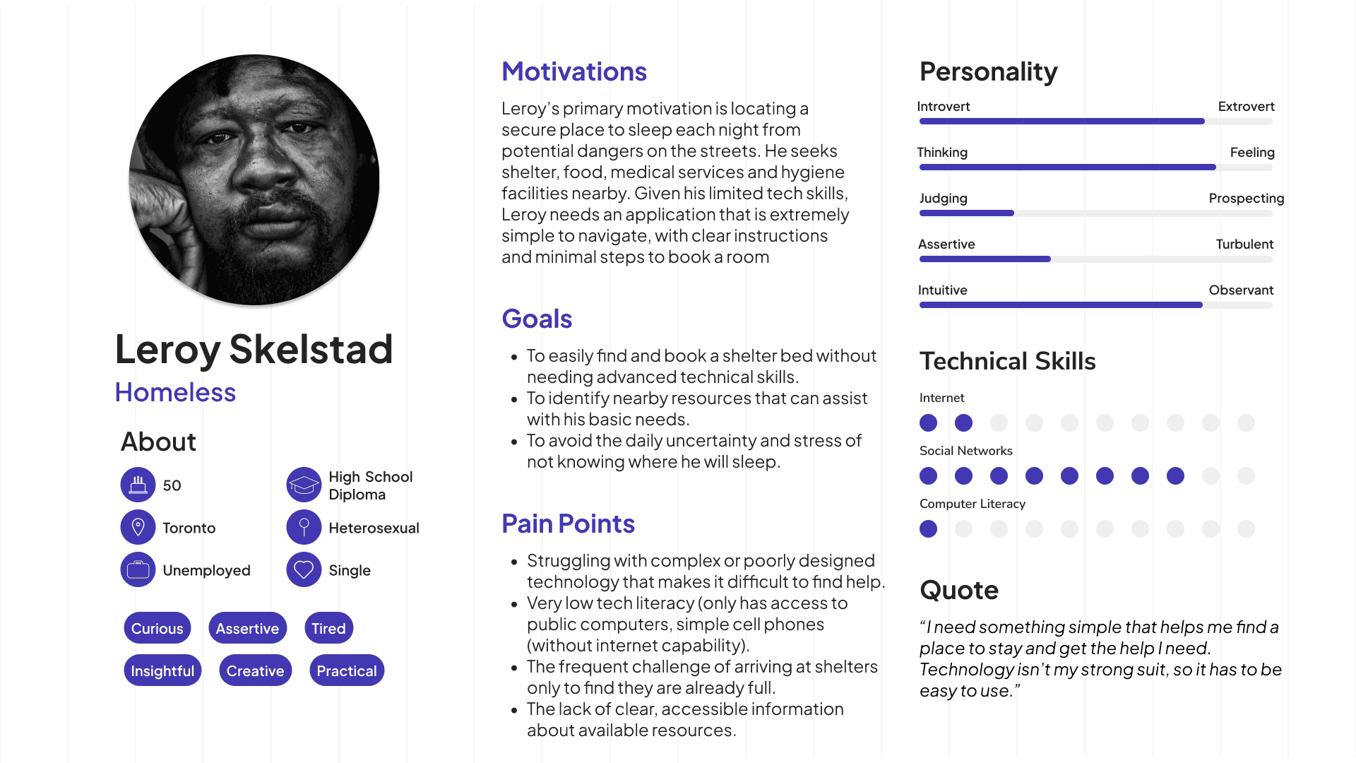
As part of the completion process to the user research stage, I generated three user personas that represent a common group of homeless individuals and personas that also represent the marginalized communities within the homeless demographics of Toronto.
Persona 1
Persona 2
Persona 3
Ideation
I explored various ideas, including creating a simple booking app for shelters inspired by platforms like Booking.com and Airbnb. I ensured the design remained minimalistic to cater to a wide range of users, including disadvantaged individuals. Additionally, I considered how to protect user privacy by requiring only essential information for booking to maximize security.
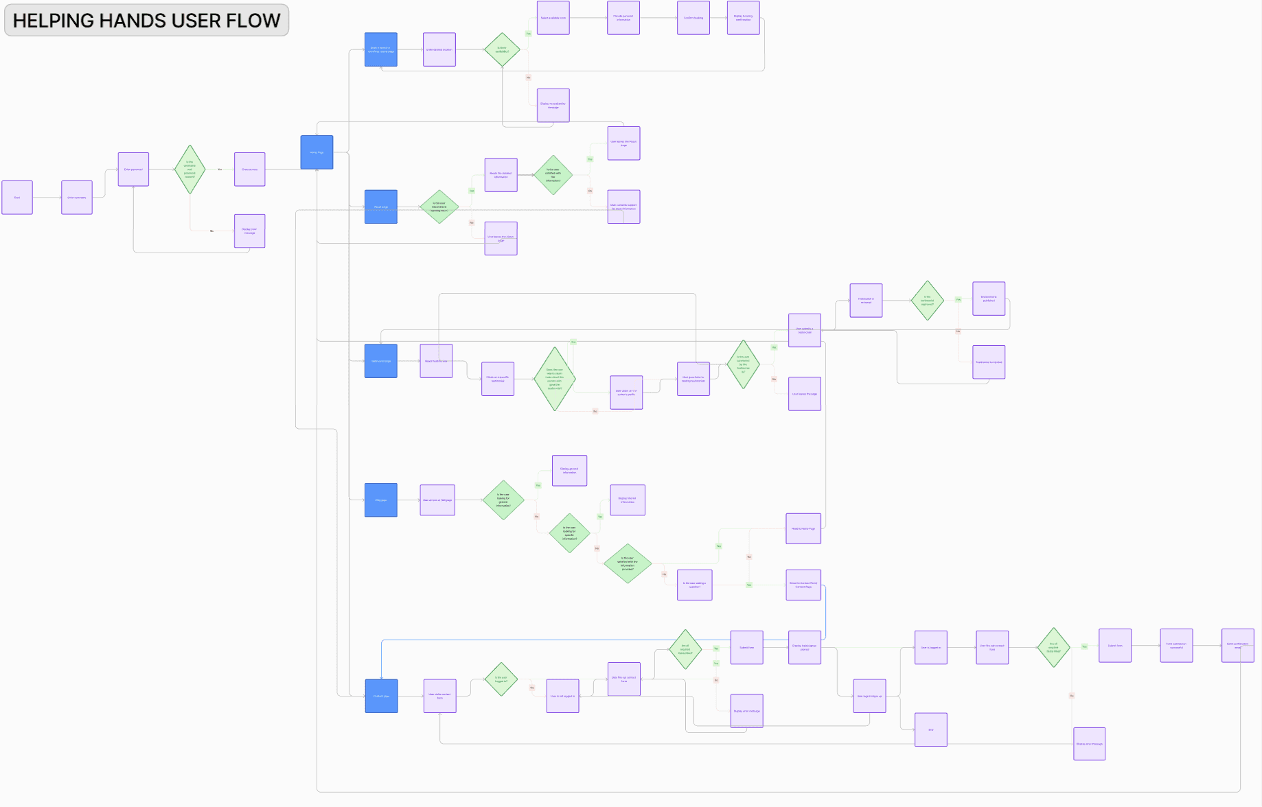
Ultimately, I narrowed down to a streamlined, minimalistic booking app that prioritizes user privacy and security, ensuring accessibility and protection for this vulnerable population. Here is the user flow generated using FigJam that would later change as a result of the design process:
Low Fidelity Sketches
Here are some of the quick initial sketches used as part of the initial iteration process. I ideated over the user flow, to solidify ideas of the home screen, booking/reservations, about page, contact page and more.
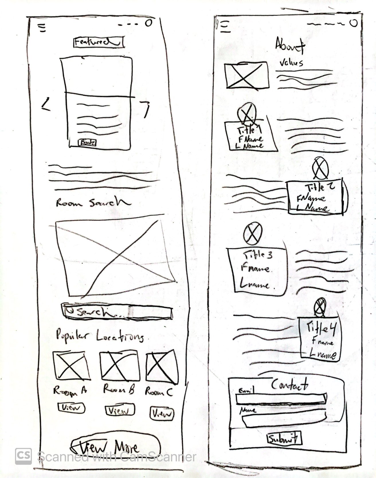
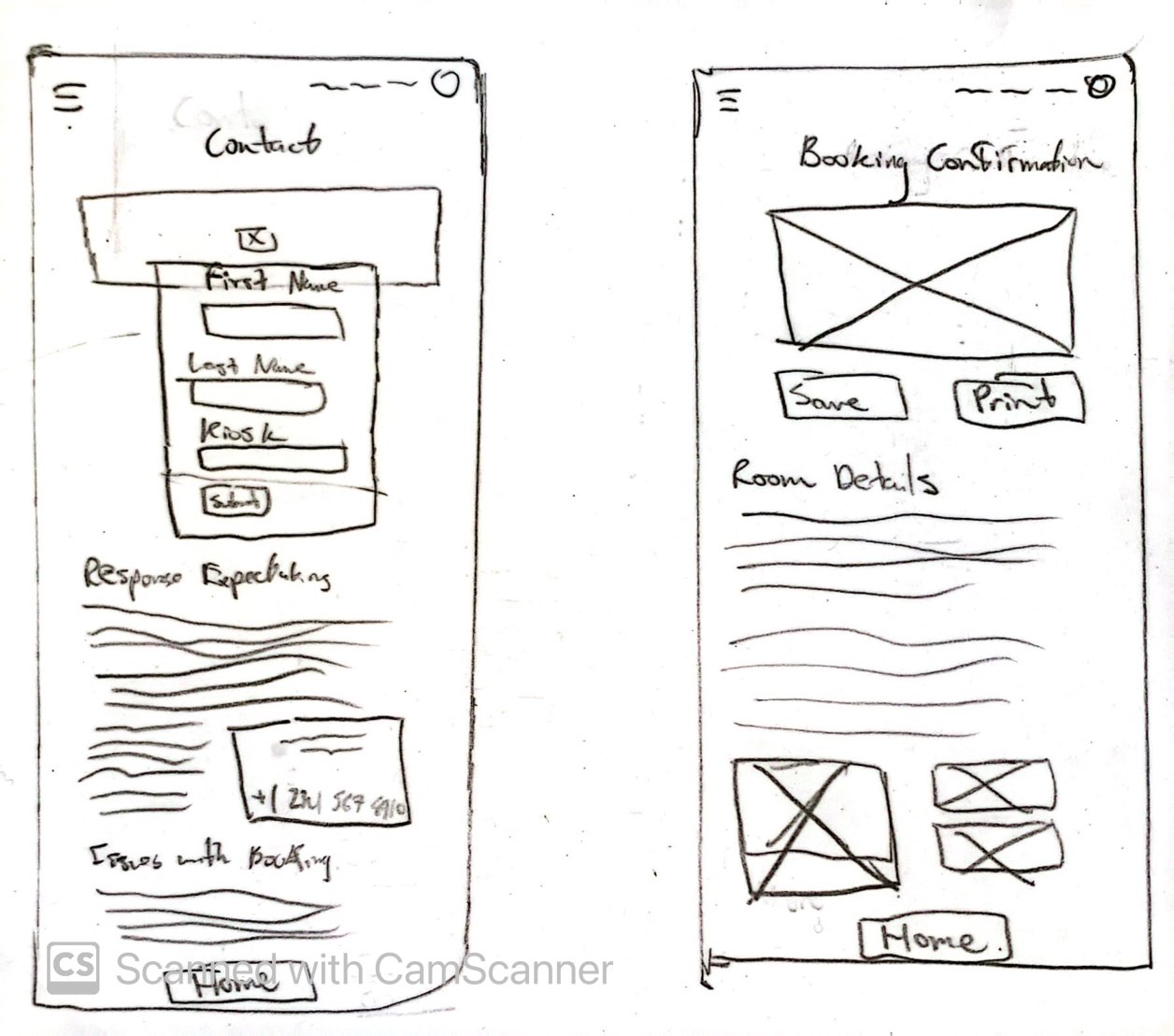
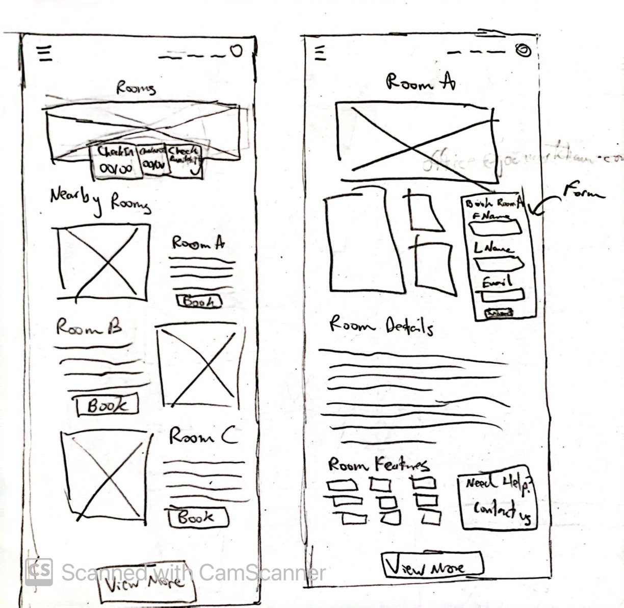
Wireframing
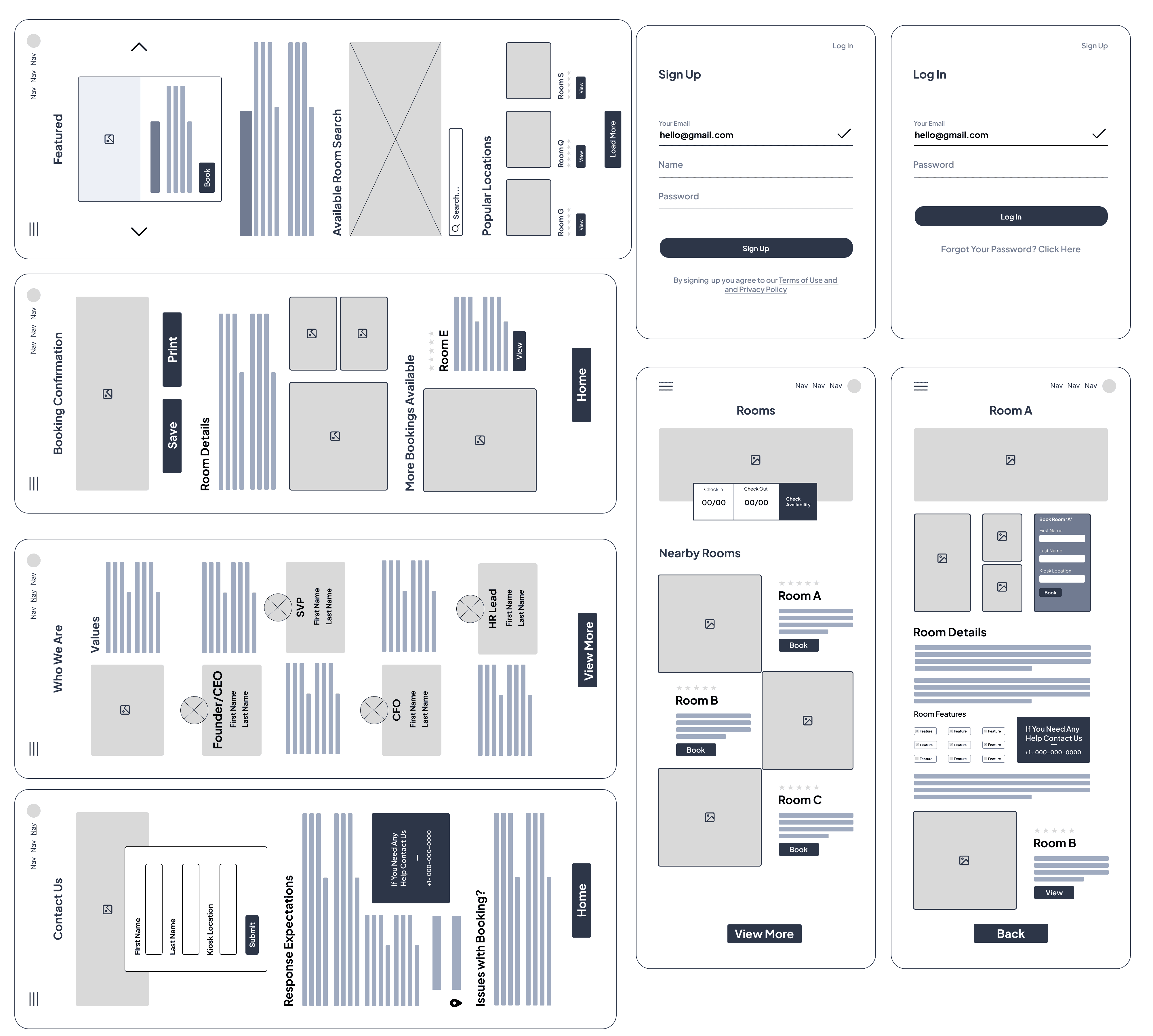
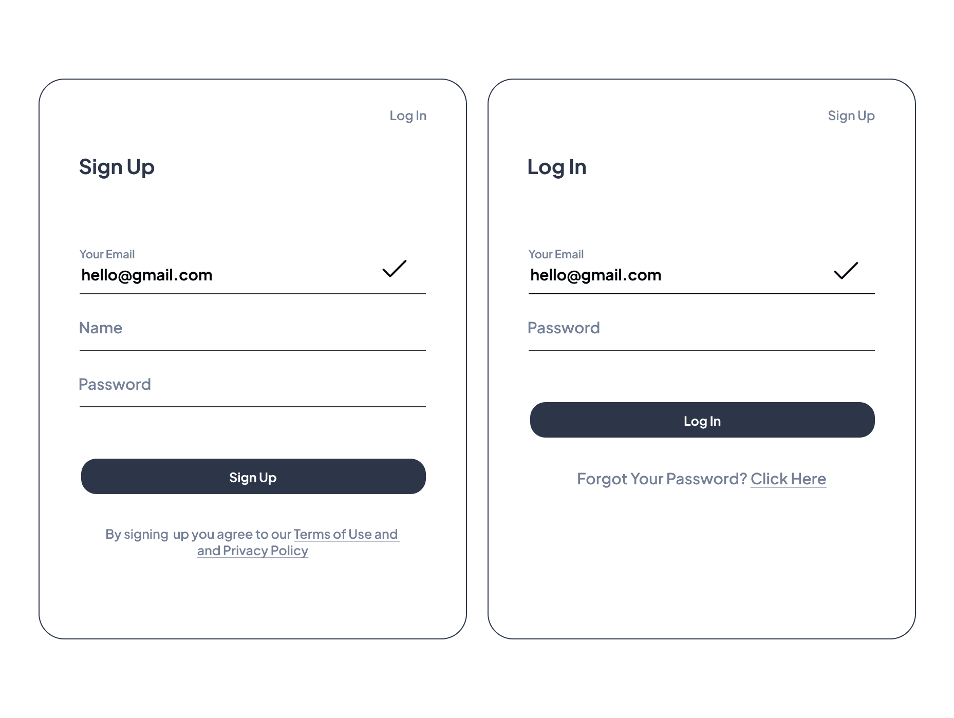
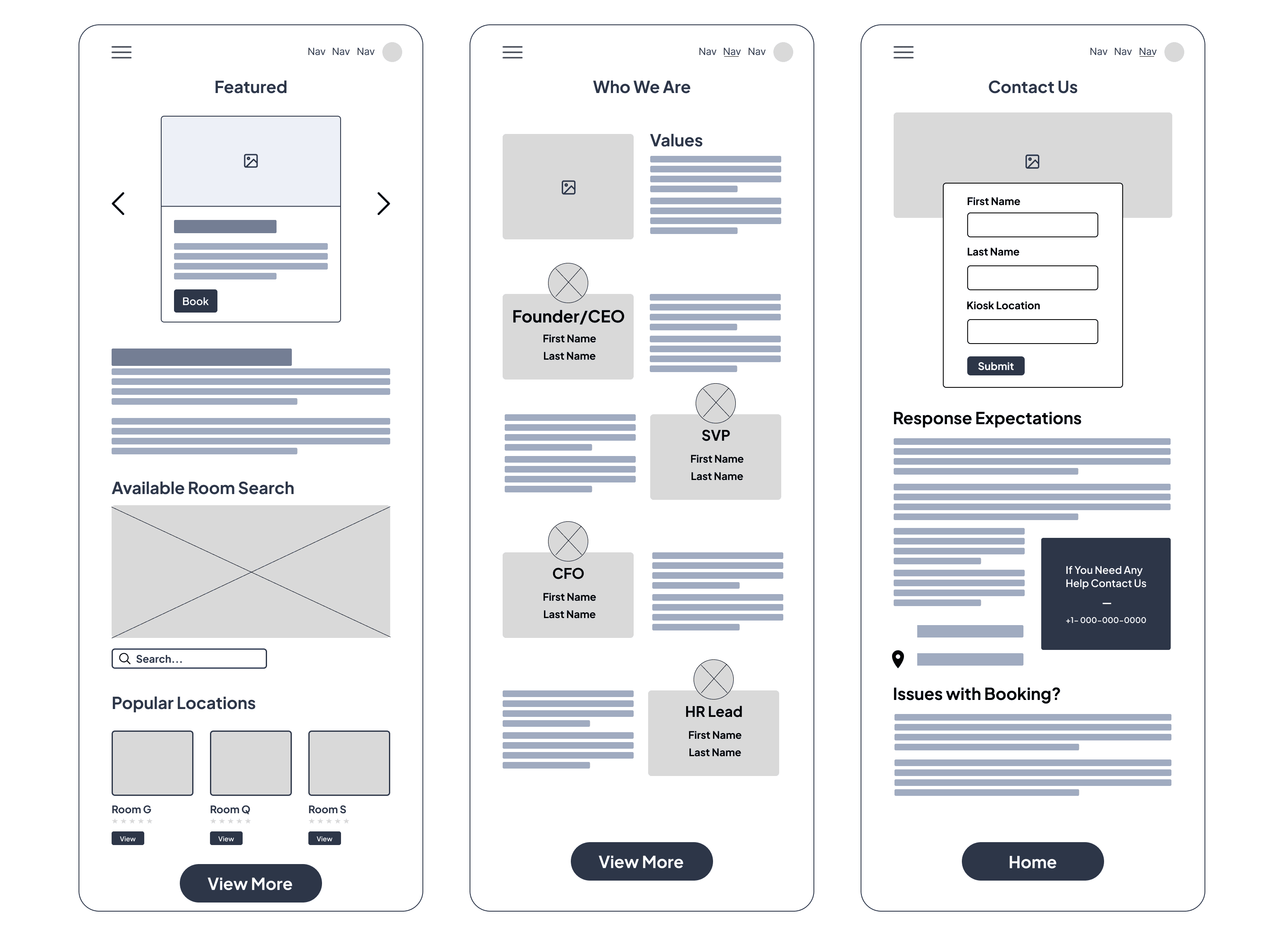
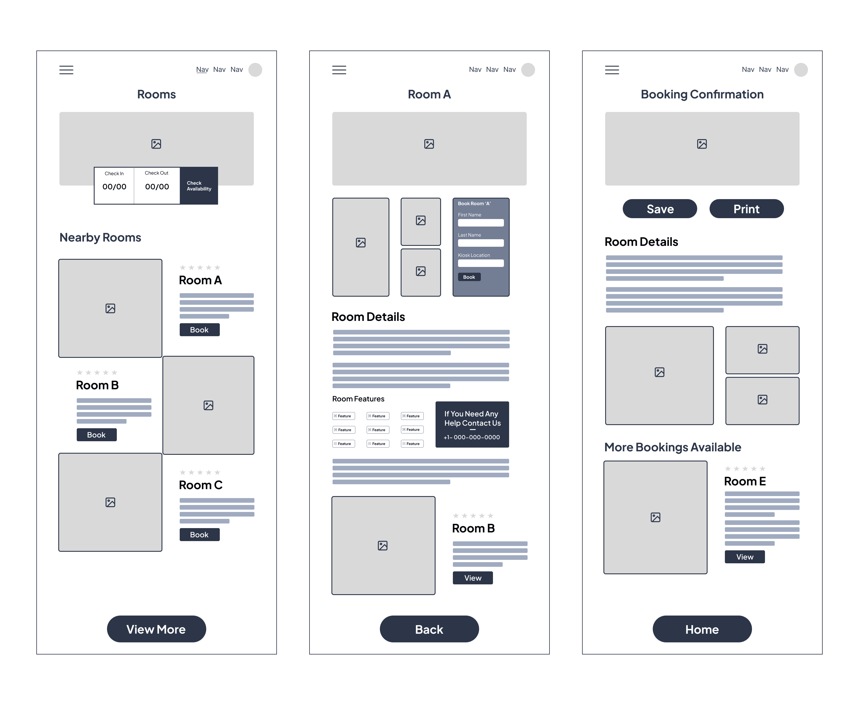
The low-fidelity mockups include screens for the login, sign-up, home, booking/room reservation, about, and contact pages referencing the prior sketches. I encountered challenges in maintaining consistency in component sizing, which I learned is crucial for adhering to user-centric design principles. This phase taught me the importance of consistent design elements to enhance usability and accessibility for all users, a challenge at the beginning of the iteration process.
User Testing Insights
For this project, I had the opportunity to receive evaluation and feedback from my professor, James Reid, in which he would critique my wireframes in the iteration process, looking at the design principles I used to see whether or not my design would be functional to transition into the design phase. The professor highlighted that he was content with the overall design of the wireframes and that I had met the criteria for the needs of this stage of the project.
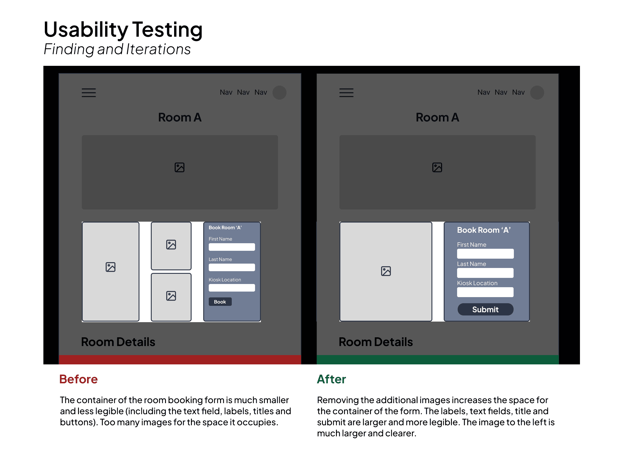
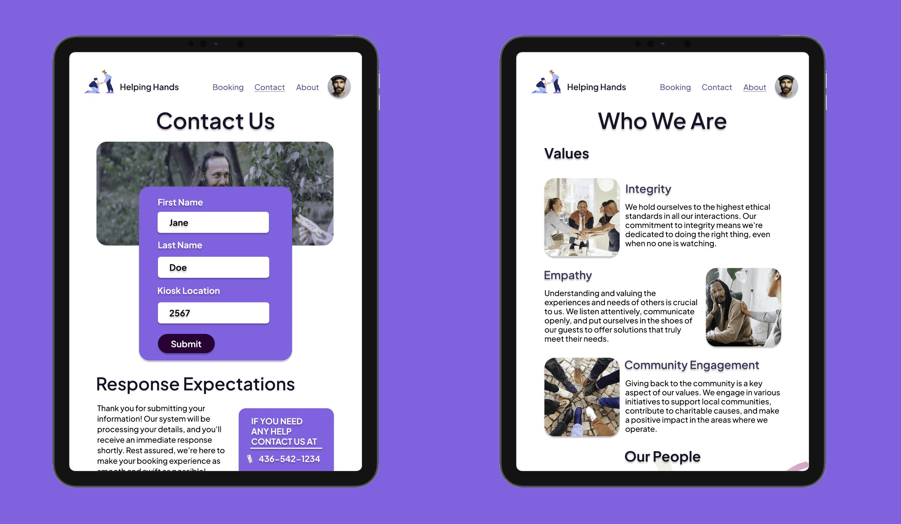
However, I wanted to make one change to the room reservation page where the user must fill out a form, inputting basic personal information such as their first name, last name and kiosk number. First, rather than placing three separate images next to the form, I reduced the number to one, increasing the image's scale and clarity. I could then enlarge the form's text, fields and "submit" button, enhancing the legibility of the form, which is essential for the shelter booking process.
Visual Design
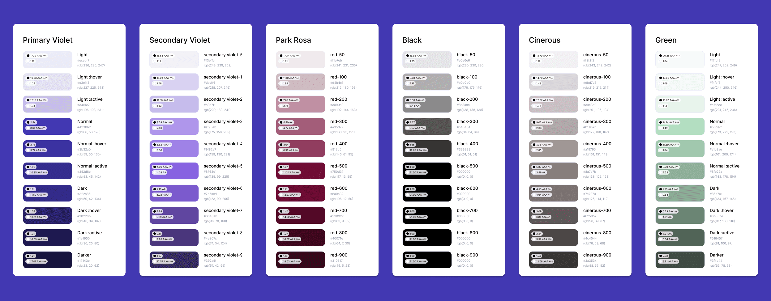
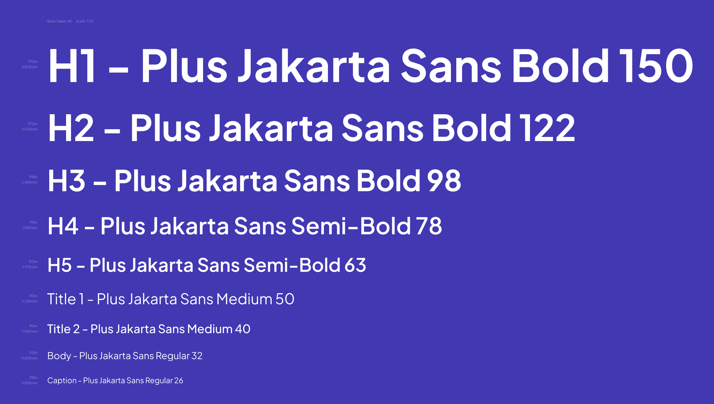
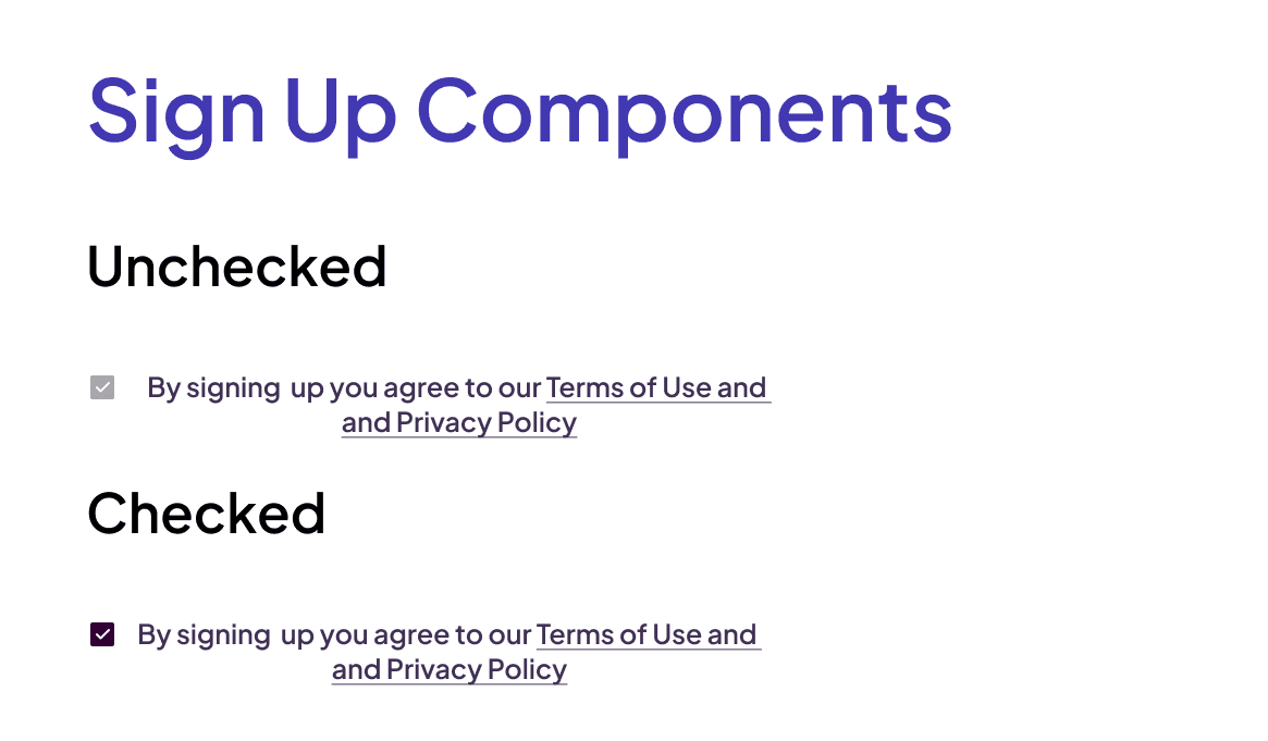
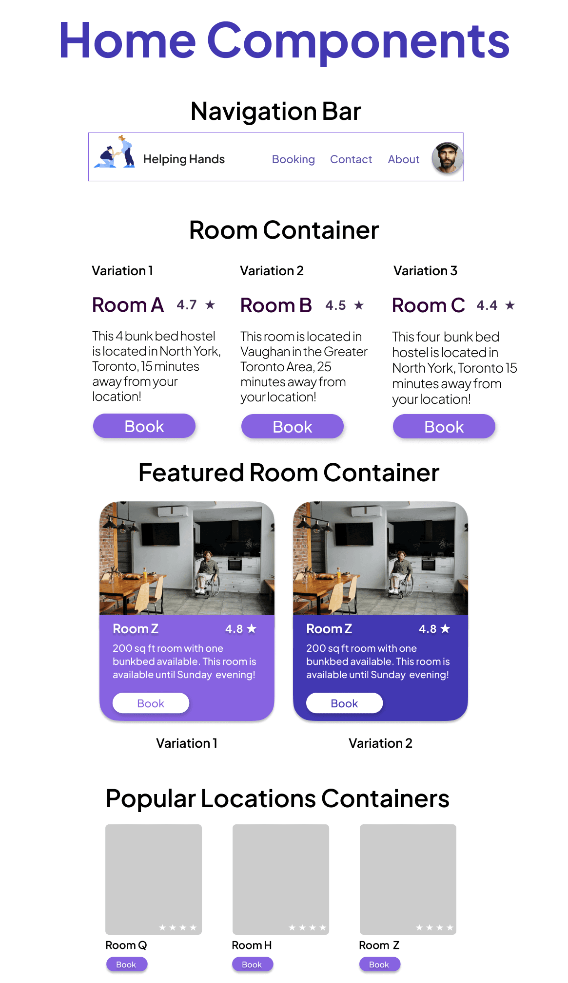
The font used for this project is Plus Jakarta Sans. As part of the design process, I had to create a design library including logos, a font library, a colour palette and components such as buttons, navigation, cards, containers and more.
Color Palette (created using the "Foundation" Figma plugin)
Text Styles
Component Library
Final Design Solution
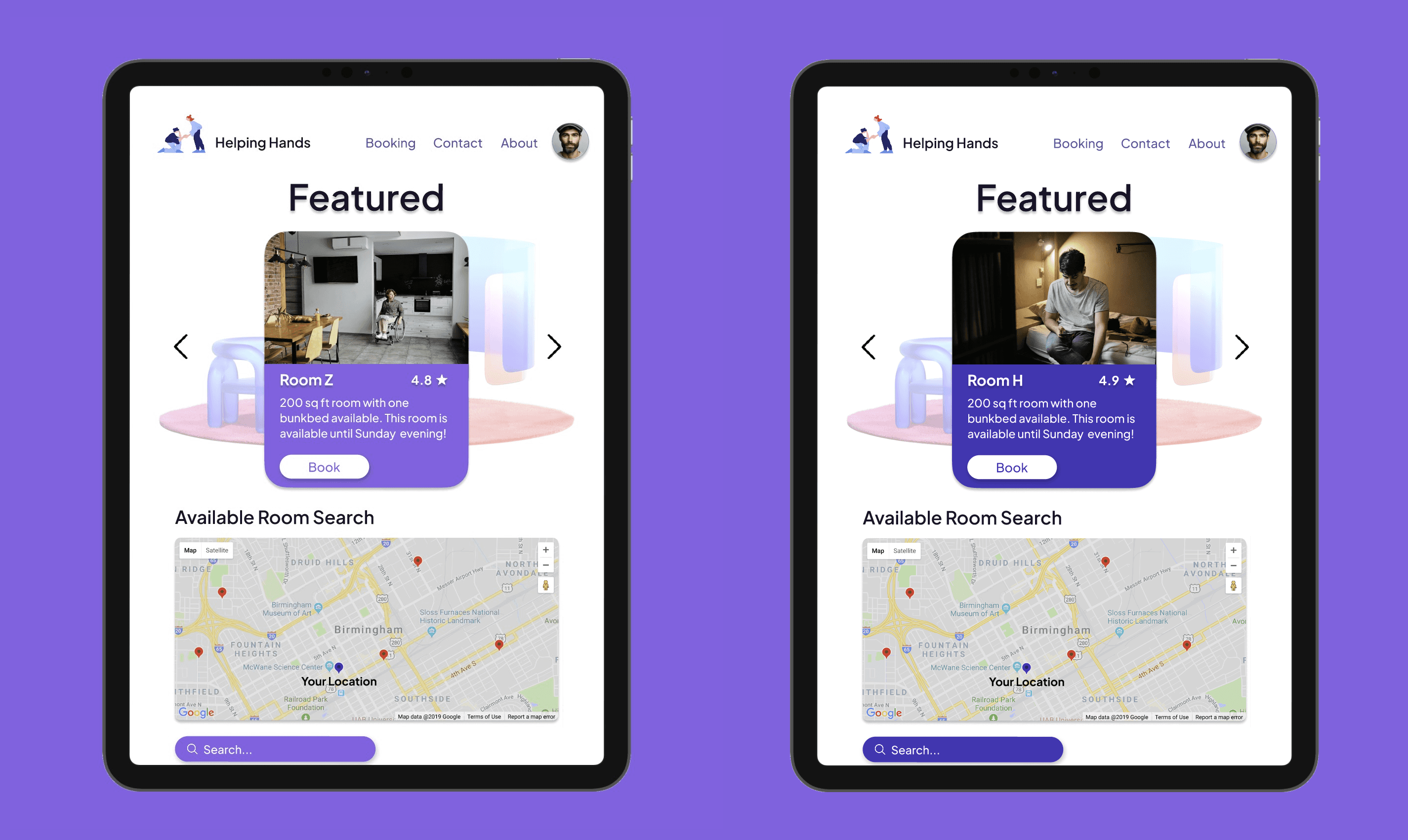
To arrive at the final solution, I built upon the initial low-fidelity wireframes by incorporating detailed components from my design library, including colour palettes like secondary violet #8763E1 and primary violet #310036, and text styles such as Plus Jakarta Sans Bold and Italic. I also used reference images from Pinterest to create an intuitive, warm, and user-friendly high-fidelity mock-up, ensuring a cohesive and visually appealing design.


Figma Prototype
Here is the Helping Hands final prototype! It effectively combines functionality and aesthetics to provide a seamless experience for users, addressing the critical needs of disadvantaged and marginalized communities by making shelter booking accessible and secure.
Conclusion + Key Takeaways 🔑
This was my first ever solo UX/UI case study project 🥳!
I'm immensely grateful for this humbling and quite challenging learning experience, which allowed me to deeply engage with the iteration and design process. Experiencing this firsthand has been incredibly enlightening. Helping Hands is an amazing initiative for social change. Here are a few key lessons I learned after completing this project:
The importance of component sizing consistency for user-centric design principles: For my next UX/UI project, I want to stick better to the principle of consistent component sizing. This way, I won't have to keep going back into my design library to make edits. I realized that maintaining consistent sizing not only makes the app smoother and easier to navigate for users but also keeps the overall look clean and coherent. It helps reduce cognitive load and improves accessibility for everyone.
The impact of thorough research in understanding and addressing user needs effectively: I also want to spend more time conducting user testing rounds and A/B testing in future projects, along with tracking user activity to understand how users interact with the prototypes. Gathering user feedback is essential to ensure Helping Hands meets the diverse needs of all its users. Additionally, adhering to AODA and WCAG standards for text, images, and other elements is crucial for creating an inclusive and accessible design.
The value of utilizing design libraries and reference images to enhance visual appeal: For this project, I realized that I heavily underused the colour library I created. Moving forward, I want to make better use of these resources to ensure a more cohesive and visually appealing design. Leveraging the design library more effectively will help streamline the design process and enhance the overall aesthetic quality of future projects.
Credits
I would like to extend a special thank you to my professor at Seneca Polytechnic, James Reid, for his invaluable feedback throughout the entire iteration and design process of Helping Hands. His guidance and insights were instrumental in making this project possible. This project would not have been complete without his support and expertise 👏.
